Design comparison
SolutionDesign
Solution retrospective
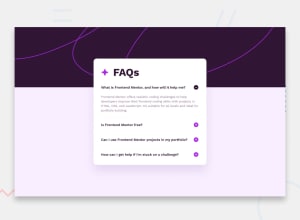
FAQ Accordion Main Challenge Completed feel free for comment Thank You !!!
Community feedback
- @LuispmvPosted 12 months ago
Hi! I can see you had the same issue I encountered when coding a similar page. The problem I'm referring to is the margin issue when toggling the buttons. I fixed this by using z-index with the main card, and on the same card, adding both margin-bottom and margin-top to correct this.
1
Please log in to post a comment
Log in with GitHubJoin our Discord community
Join thousands of Frontend Mentor community members taking the challenges, sharing resources, helping each other, and chatting about all things front-end!
Join our Discord
