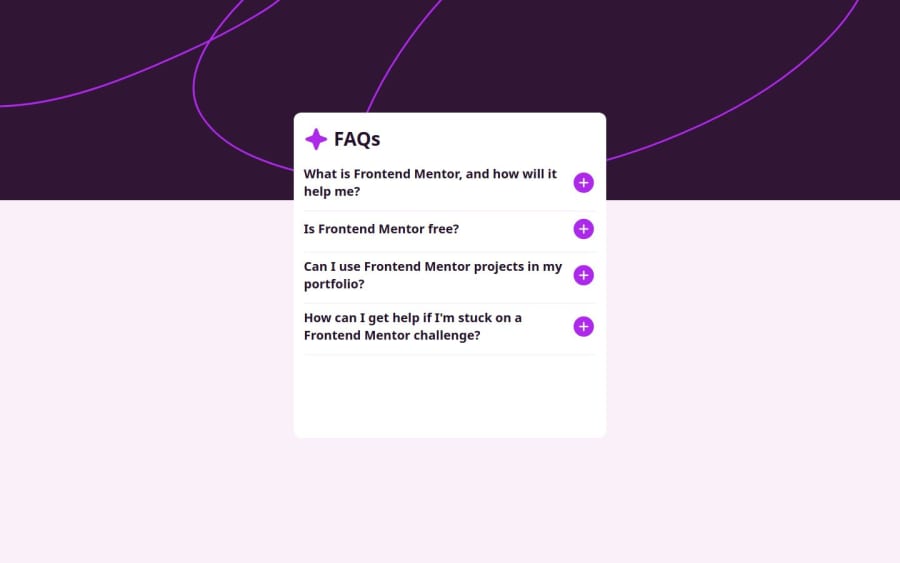

Design comparison
SolutionDesign

Solution retrospective
What specific areas of your project would you like help with?
I still have a question, if its possible to make the container shorter and after clicking a question the container goes bigger and everything fits on it. For now I left like this.
Community feedback
- @saimasial-bitPosted 11 days ago
"Great job on the solution! The layout looks clean and responsive. However, I noticed that you haven't used semantic HTML elements like <article> and <section>. Adding them would improve accessibility and readability. Also, on smaller screens, the text alignment looks slightly off. Adjusting the padding/margins might help. Keep up the great work!"
1

Please log in to post a comment
Log in with GitHubJoin our Discord community
Join thousands of Frontend Mentor community members taking the challenges, sharing resources, helping each other, and chatting about all things front-end!
Join our Discord