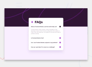
Design comparison
Solution retrospective
I'm mainly posting it to compare the design haha, but I'll finish it 100%
What challenges did you encounter, and how did you overcome them?not completely finished, I still miss the good behavior of the accordion + the icon change.
Still some difficulties with the JS.
Community feedback
- @kodan96Posted 6 months ago
hi there 🙌
Using
.forEach()for this is more efficient. Your icons won't toggle, because you don't seem to tell them to.you can include
icon[i].style.display = 'none'
minusIcon[i].style.display = 'inline'
into your
eventListener, but you should also take care of switching them back with the same method, but backwards.Hope this helps 🙏
Good luck and happy coding!
Marked as helpful0@FloPereira75Posted 6 months ago@kodan96 Thanks for your return!
I took a break from the code and I'm getting back into it, JS is having a hard time coming back haha
For the icons I probably had to remove the code since it didn't work.
I'm going to take a look at forEach(), and functions in general.
Thanks again
1@kodan96Posted 6 months ago@FloPereira75
You can also check my solution, but note that I used jQuery (a JavaScript library) to solve it. If you wanna give it a try you can find the CDN here.
Keep it up, see you at the top. 🔝
Marked as helpful0@FloPereira75Posted 6 months ago@kodan96
Yo Koda!
I finally succeeded!
7 lines of JS codes.
I mainly play with CSS and the active class which makes the MINUS button appear and the PLUS button disappear.
I don't know if it's necessarily the best method but it works and it comes out of my brain so I'm happy with it anyway haha.
Thanks again to you
0
Please log in to post a comment
Log in with GitHubJoin our Discord community
Join thousands of Frontend Mentor community members taking the challenges, sharing resources, helping each other, and chatting about all things front-end!
Join our Discord
