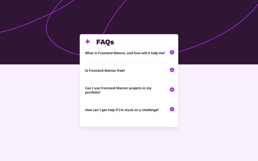
Design comparison
Solution retrospective
I’m most proud of successfully implementing the FAQ accordion with event delegation, ensuring smooth toggling and accessibility across all devices. The transitions and animations turned out well, and the solution feels polished. Next time, I would focus more on testing edge cases and refining the keyboard accessibility further for an even smoother user experience.
What challenges did you encounter, and how did you overcome them?One challenge was getting the accordion to collapse and open properly using event delegation. It was tricky to manage the active states and ensure only one FAQ opened at a time. I solved this by adding a method to automatically close other active FAQs when one is clicked, improving the toggle functionality.
Community feedback
- @YacoubDweikPosted 6 months ago
Salam bro! It is amazing! nothing much to say, The only is that I wish you did was this: <button aria-expanded="false" aria-controls="faq2"> Is Frontend Mentor free? ::after </button> in this code I wish you had your text inside a span cuz on mobile the button & the text get very close to each other so there should be always some space between them, and this could have done If I could catch that text, the ::after has been given position absolute so there's no way to have any margin or padding around it. I can't stop expressing my love to your way of doing things, keep it up!
Marked as helpful0@Mubarak-AdeyemiPosted 6 months agoWa alaykumus salam, bro.
Thanks much. I noticed that but to solve that by adding more padding to the right side of the questions to create more spacing between the button icon and the text.
1
Please log in to post a comment
Log in with GitHubJoin our Discord community
Join thousands of Frontend Mentor community members taking the challenges, sharing resources, helping each other, and chatting about all things front-end!
Join our Discord
