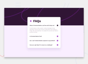
Design comparison
SolutionDesign
Solution retrospective
What are you most proud of, and what would you do differently next time?
I’m proud I’ve been able to finally complete this challenge.
What challenges did you encounter, and how did you overcome them?- Changing the plus and minus image for the button.
- How to set the background image and change it with respect to the viewport
- How to place the accordion nicely on the page
Community feedback
- @muhamed-kanapiyaPosted about 2 months ago
I would add some padding after faq titles, and some cursor pointer to plus minus, and bg image shouldnt be full width?
0
Please log in to post a comment
Log in with GitHubJoin our Discord community
Join thousands of Frontend Mentor community members taking the challenges, sharing resources, helping each other, and chatting about all things front-end!
Join our Discord
