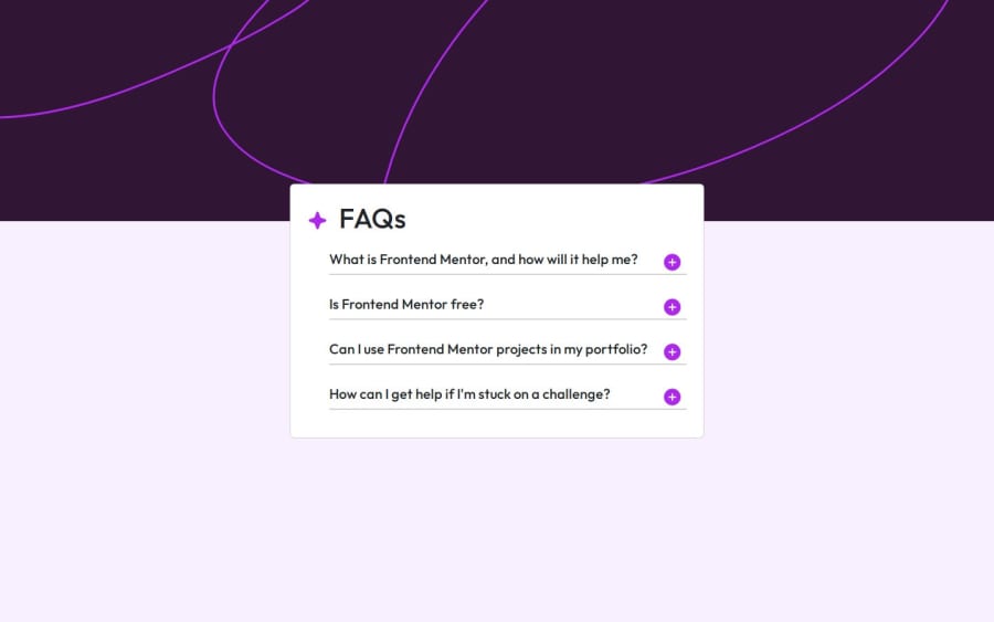
Design comparison
Solution retrospective
"I've completed the first part of the solution retrospective. In this task, I initially identified the parent element of the button, which allowed me to access and manipulate it effectively. Afterward, I worked on enabling the next button by adjusting its properties to ensure it became interactive. Lastly, I removed the display: none property, which had been hiding certain elements, allowing them to become visible on the page. These steps made the interface more functional and user-friendly.
If I had to do it differently next time, I would focus on optimizing the process of handling the button states and visibility. Perhaps, I could explore a more dynamic approach to managing the button's actions with fewer hardcoded values or conditions."
What challenges did you encounter, and how did you overcome them?Challenges: One of the main challenges I faced was properly accessing the button's parent element. Initially, I struggled with ensuring I was selecting the correct element, which led to issues with enabling and disabling the button at the right time. Another challenge was managing the visibility of elements, particularly removing the display: none property. I had to make sure that the right conditions triggered the appearance of the hidden elements without causing layout issues.
How I Overcame Them: To overcome the issue of selecting the right parent element, I carefully inspected the DOM structure and used JavaScript functions like querySelector and closest to accurately target the element I needed. For managing the visibility, I simplified the conditions under which the display: none property was removed by adding clear triggers and ensuring there were no conflicting styles or JavaScript events. Breaking the problem down into smaller parts and testing each step separately also helped me ensure everything worked smoothly.
What specific areas of your project would you like help with?Areas I Need Help With: I would appreciate feedback on a few specific areas of my project:
Code Structure and Optimization: While my code works, I am not entirely sure if it's structured in the most efficient way. I would love feedback on how I could improve the organization and readability of my JavaScript, especially in terms of managing button states and element visibility.
Responsive Design: I’ve followed a mobile-first approach, but I’m unsure if the transitions to larger screen sizes are smooth enough. Any suggestions on how to improve the responsiveness, especially with regards to layout and spacing on tablets and desktops, would be really helpful.
Accessibility: I'm working on making my project as accessible as possible. If there are areas where my accessibility efforts could be improved, such as keyboard navigation or ARIA attributes, I would appreciate detailed advice.
Performance Optimization: I’d like to know if there are ways I can make the project more lightweight and performant, particularly in terms of reducing unnecessary DOM manipulation or optimizing my CSS.
Community feedback
- @mowzayoPosted 6 months ago
good job, but can improve on layout to get almost close to the practise.
0
Please log in to post a comment
Log in with GitHubJoin our Discord community
Join thousands of Frontend Mentor community members taking the challenges, sharing resources, helping each other, and chatting about all things front-end!
Join our Discord
