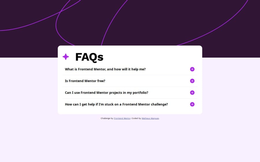
Design comparison
Solution retrospective
CSS foi mais díficil do que nos desafios anteriores e JavaScript foi algo novo, pois implementar em um projeto é diferente de ficar fazendo funções de 1+1
Community feedback
- @AdrianoEscarabotePosted 6 months ago
Hi Matheus Marques, how’s everything? I think your project turned out great! However, I have some feedback that I think might be useful:
images must have alt text unless it is a decorative image, for any decorative image each IMG tag must have empty alt="" and add aria-hidden="true" attributes to make all the assistive technologies of the Web, as screen reader.
Learn the differences between decorative/meaningless images vs important content.
A document ought to have one primary landmark, and the absence of a main tag around the page's primary content is the root of this issue. On this page, there is no other element that is more important than the one that this challenge is based on, so to solve it, wrap all the content in the'main' tag.
It's always a good idea to pay close attention to the proper use of semantic html elements because they are crucial for screen reader users to understand what the main content of the page is in the case of the'main' tag!
The rest is amazing.
I hope this is helpful. 👍
Marked as helpful1@MathMPSPosted 6 months agoObrigado, @AdrianoEscarabote! todas as dicas ajudaram resolver os problemas a respeito da acessibilidade.
1
Please log in to post a comment
Log in with GitHubJoin our Discord community
Join thousands of Frontend Mentor community members taking the challenges, sharing resources, helping each other, and chatting about all things front-end!
Join our Discord
