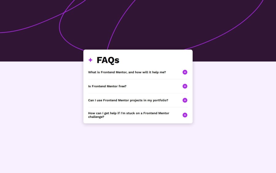
faq-accordion-main
Design comparison
Solution retrospective
Not using JavaScript for making the accordion work.
What challenges did you encounter, and how did you overcome them?I couldn't make the screen reader read the page as I wanted, it actually reads the questions but when I press "Enter" it doesn't read the answers.
What specific areas of your project would you like help with?I want some help with the accessibility. I couldn't make the screen reader (NVDA) read the answer when I press "Enter" of the corresponding question.
Community feedback
- @salomasikPosted 5 months ago
Cool! Close to the design. but there is a problem when the screen is larger than 1440 pixels, the top photo of the background does not expand.
1@AymaneOnlinePosted 5 months ago@salomasik Thank you!
I fixed it using
background-size: contain;.1
Please log in to post a comment
Log in with GitHubJoin our Discord community
Join thousands of Frontend Mentor community members taking the challenges, sharing resources, helping each other, and chatting about all things front-end!
Join our Discord
