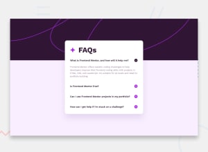
Design comparison
Solution retrospective
"Feedback welcome"
Community feedback
- @DeanogitPosted 11 months ago
Hey @yozidst,
This solution is looking great! I like a lot the animation you implemented on the icons.
I was just taking a look at the starting state, is there a way to start with the
minus-iconon theactivesectionto begin with?In the HTML it starts with this
<img id="button0" src="./assets/images/icon-plus.svg" alt="plus-icon">
        </strong>
But could be
<img id="button0" src="./assets/images/icon-minus.svg" alt="minus-icon">
        </strong>
Also I'm not sure it is important, but the
altattribute remainsplus-iconwhether theicon-plus.svgoricon-minus.svgis rendered.These are tiny details but I thought I'd share anyways, your's is a great solution regardless
All the best
Marked as helpful1@yozidstPosted 11 months ago@Deanogit
Hello,
Thanks for taking the time to look over my code. I figured out the 1st icon switch later on but nice catch on the alt=" ". I missed that entirely. Awesome tips!
1
Please log in to post a comment
Log in with GitHubJoin our Discord community
Join thousands of Frontend Mentor community members taking the challenges, sharing resources, helping each other, and chatting about all things front-end!
Join our Discord
