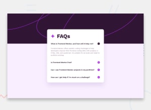
Design comparison
SolutionDesign
Solution retrospective
What are you most proud of, and what would you do differently next time?
- Most Proud of:
- Tried BEM naming convention.
- Explored the details & summary elements.
- Made minor adjustments to spacings and dimensions for consistency.
- Changes for Next Time:
- Add animations/transitions.
- Implement using other methods (like grid, etc.).
- Toolkit:
- 📄 HTML
- 🎨 CSS (SASS)
- 🖥️ Desktop-First Design
- 🖼️ Reference (jpg)
- ⏱️ 2 Hours
Community feedback
Please log in to post a comment
Log in with GitHubJoin our Discord community
Join thousands of Frontend Mentor community members taking the challenges, sharing resources, helping each other, and chatting about all things front-end!
Join our Discord
