

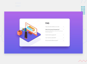
Design comparison

Solution retrospective
I had trouble converting this to mobile . Can anyone tell me how to do it. The question does not fallback to its original color. Suggest a fix for this and more. Feedback will be highly appreciated. I just dont why the images dont show on github pages.
Community feedback
- @climb512Posted over 1 year ago
Hi, I took a look at your solution and can offer a few suggestions:
1 -- some images not appearing: this is just due to typos in your html. Make the image path relative to the index.html, not the root of the server (in this case, just add a . before the path, because "." means "starting from this directory").
<img src="/images/illustration-woman-online-desktop.svg" alt="" class="img2">
should be
<img src="./images/illustration-woman-online-desktop.svg" alt="" class="img2">
2 -- font colors not "resetting" correctly if multiple <li>s are clicked: Your javascript starts out with a global "i" set to true, then you toggle this value every time an <li> is clicked -- this works if only one <li> is ever opened and then closed before another one is clicked, but breaks when two of them are opened in a row. You could change this to open an <li> if it has the class of "closed" and close it if it has the class of "open", and use querySelector to set and remove those classes immediately after you set the font-weight, color and rotate.
3 -- mobile vs desktop versions are usually done with a @media query at some breakpoint. In this case, a common breakpoint at which to change the layout might be 765px (very common point to change between tablet and desktop). Put all your code for the MOBILE version OUTSIDE the breakpoint, and all the DESKTOP version code INSIDE the breakpoint. You could do it the other way around, but this way will be "mobile-first" development style, an accepted best practice dev style. So in code:
...
/* all normal css code to style the mobile version */
...
@media screen and (min-width:765px)  {
/* all normal css code to style the DESKTOP version (larger than 765px) */
}
I hope this helps you get started with solving your questions. Good job!
Marked as helpful0 - @agomez99Posted over 1 year ago
For github to show your images add the . In the path before the folder
<img src="./images.... />Marked as helpful0


Please log in to post a comment
Log in with GitHub
Join our Discord community
Join thousands of Frontend Mentor community members taking the challenges, sharing resources, helping each other, and chatting about all things front-end!
Join our Discord