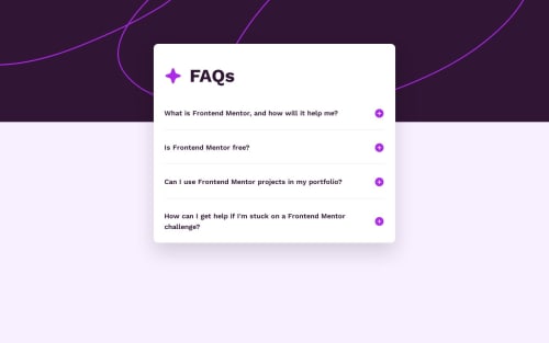
Submitted over 1 year agoA solution to the FAQ accordion challenge
FAQ Accordion
next, react, tailwind-css, typescript
@Atatra

Solution retrospective
What challenges did you encounter, and how did you overcome them?
Couldn't manage to use CSS only. My CSS-only solution resulted in a bad layout: the title of the question, the checkbox input and the answer were rendered on the same line. This is because to conditionally render my tag (with the answer) based on the "checked" value of the input, they had to be siblings at least. Or, that's what I read. So I had to resort to JS, unfortunately. :'(
Code
Loading...
Please log in to post a comment
Log in with GitHubCommunity feedback
No feedback yet. Be the first to give feedback on Atatra's solution.
Join our Discord community
Join thousands of Frontend Mentor community members taking the challenges, sharing resources, helping each other, and chatting about all things front-end!
Join our Discord