
Design comparison

Solution retrospective
I'm most proud of how quickly I've been able to learn and apply new concepts in web development. For example, implementing custom cursors and successfully building out an FAQ toggle functionality are definitely highlights. When I look back, I realize I’ve developed a stronger understanding of how CSS and JavaScript work together, which has allowed me to make designs more dynamic and interactive.
If I were to do things differently next time, I would focus on making my code even more modular and reusable. I’ve learned a lot about creating cleaner, more efficient code, but I’d aim to refactor more early on instead of letting repetitive code accumulate. I would also pay extra attention to making sure my designs are fully responsive right from the start to avoid reworking them later.
What challenges did you encounter, and how did you overcome them?For my project, one area where I’d like help is with optimizing my JavaScript for better performance when handling multiple DOM elements. Specifically, I want to improve how I handle event listeners for dynamic content, making sure my code remains clean, scalable, and efficient as the project grows.
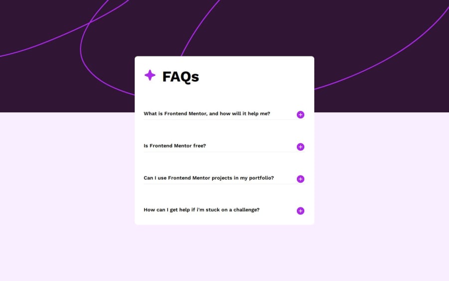
What specific areas of your project would you like help with?As for challenges, one of the bigger obstacles I faced was when trying to manage a lot of interdependent styles and scripts across multiple elements. For example, in the FAQ toggle section, I had to ensure that each element’s state (expanded or collapsed) was tracked individually, while also keeping the UI consistent. To overcome this, I leveraged event delegation and careful class manipulation, which allowed me to dynamically control states without overcomplicating things.
I also had issues with making the design responsive at first. I found myself needing to constantly test on different devices, but using media queries helped me adjust the layout properly. I plan to improve the responsiveness of my design further to ensure smooth experiences across all screen sizes.
Community feedback
- @Dadv-a11yPosted about 2 months ago
the font size on mobile is too small . i suggest that you use <button></button> for the class click-button instead of <span></span> this will make the site a bit accessible we can't use the keyboard to navigate on the button and on some screen the button are not well display
Marked as helpful1

Please log in to post a comment
Log in with GitHubJoin our Discord community
Join thousands of Frontend Mentor community members taking the challenges, sharing resources, helping each other, and chatting about all things front-end!
Join our Discord