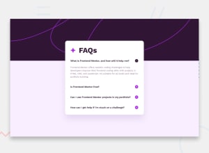
Design comparison
SolutionDesign
Community feedback
- @0xabdulkhaliqPosted 11 months ago
Hello there 👋. Congratulations on successfully completing the challenge! 🎉
- I have other recommendations regarding your code that I believe will be of great interest to you.
ACCORDION 🔴 :
- I want to express my applause for the efforts you've taken to convert design image into working code for this challenge, Your designing skill is great apart from that you need to focus on improving accessibility.
- The accordions needs be re-written with semantic markup, The best way to go with creating the accordion elements in this challenge would be with the
detailsandsummaryelements (or perhaps a combination of buttons and other elements).
- They are already fairly accessible and provided a clean, semantic way to create accordion elements. I see you have used the
div&pelements for the accordions, but those are not interactive or accessible by keyboard, so not all users will be able to open the accordions to see the content inside.
- MDN's reference is a great place to start learning about the
detailsandsummaryelements if you are interested.
- If you have any questions or need further clarification, you can always check out
my submissionfor legacy version of this challenge and/or feel free to reach out to me.
.
I hope you find this helpful 😄 Above all, the solution you submitted is great !
Happy coding!
Marked as helpful0
Please log in to post a comment
Log in with GitHubJoin our Discord community
Join thousands of Frontend Mentor community members taking the challenges, sharing resources, helping each other, and chatting about all things front-end!
Join our Discord
