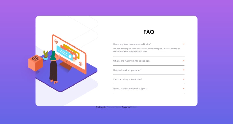
Not Found
Not Found
Not Found
Not Found
Not Found
Not Found
Not Found
Not Found
Not Found
Not Found
Not Found
Not Found
Not Found
Not Found
Not Found
Not Found
Not Found
Not Found
Not Found
Not Found

Submitted

FAQ Accordion HTML, CSS, JS

@GColville

Desktop design screenshot for the FAQ accordion card coding challenge

This is a solution for...

  • HTML
  • CSS
  • JS
1newbie
View challenge

Design comparison


SolutionDesign

Solution retrospective


This one was a struggle for me with a lot of work to be done.

I'm not sure I went about this the right way, positioning the elements was really tricky.

Looking at the code, is there a better way to have approached this?

UPDATE:

I've re-done the code after some practice and looking around for pointers. Still not perfect, there are some bugs to fix:

  1. Card height increases when each answer is expanded. Not sure if this should really happen.
  2. Font-weight for the question text is giving me trouble
  3. Arrow rotate to be done (had issues)

Community feedback

@pikapikamart

Posted

Hey, awesome work on this one, though the default layout looks like the mobile design which should not be. Did you code this on a wide screen? You must account that there are 1366x767 resolution screen for desktop.

Some suggestions would be:

  • Avoid using height: 100vh on a large container, this makes the element's height limited to the remaining screen/viewport's height. Instead, use min-height: 100vh, this takes full viewport but allows the content to expand if it needs to. Also remove the width: 100% on the body tag, block element like the body tag have a default width: 100%.
  • You are missing the cube image on the desktop layout, you might want to check that one out.
  • It would be better if the question name can be toggled to show the answer as well. Since you are using button for the dropdown icon, you can wrap the question name inside the button so that they will activate it as well. But to be honest, I would just use details element on this one. Since using regular button needs to be manipulated in javascript to make it more accessible for users, details is already accessible which is great.

Aside from those, great work again on this one. But maybe try to lower down your breakpoint so users won't have to zoom out just to see the desktop layout.

Marked as helpful

2

@GColville

Posted

@pikamart

Thanks for the pointers!

Lol yeah I'm using widescreen, didn't even think about the breakpoint being what it is, silly mistake!

I did find this one quite difficult, so will be coming back and starting this one from the beginning again once I've done some practice and reading.

Thanks again for the tips :)

0
P

@webdev1kev

Posted

Yea this one was tricky for me as well!

For positioning elements I would definitely try to take advantage more of flexbox so you don't have to hard code a lot of margins, especially for the faq-container, since its more grid-like and uniform unlike the image, not sure how to effectively use flexbox on the image lol.

Also try to use more percentage or relative values in margins, padding, so that items can position themselves more dynamically when the screen size changes.

Other than that keep at it!

Marked as helpful

1

@GColville

Posted

@kdavis010397

Hey, thanks for the hints and tips, really appreciate that :)

Flexbox is definitely one those areas I think I'm not utilising enough yet, need to learn more lol.

That's a really good point about % or relative values, I see a lot of people using them. Never truly got their value till you mentioned dynamic positioning.

Thanks again for the pointers :)

0

Please log in to post a comment

Log in with GitHub
Discord logo

Join our Discord community

Join thousands of Frontend Mentor community members taking the challenges, sharing resources, helping each other, and chatting about all things front-end!

Join our Discord