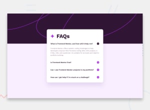
Design comparison
SolutionDesign
Solution retrospective
What are you most proud of, and what would you do differently next time?
NA
What challenges did you encounter, and how did you overcome them?The js part was a little challenging for me, but eventually i figured it out.
What specific areas of your project would you like help with?Any feedback would be appreciated.
Community feedback
- @ShoaibShujaPosted 5 months ago
Amazing job my friend but the mobile design seems to be overflowing a bit. The problem seems to be the .container's max-width property. you can fix this by either changing the max-width simply to width. And you can set the width from 600px to 50% or as you wish but this is optional which makes adjusting easier and then inside the media query set the width to 90% or your own preferred pixels. Hope this helps and have a beautiful day.
1
Please log in to post a comment
Log in with GitHubJoin our Discord community
Join thousands of Frontend Mentor community members taking the challenges, sharing resources, helping each other, and chatting about all things front-end!
Join our Discord
