Design comparison
Solution retrospective
TIPS?
Community feedback
- @petritnurediniPosted 9 months ago
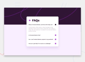
Congratulations on completing your FAQ accordion project! It's a significant achievement, and the functionality and design look great. Here are some best practices recommendations to enhance your project:
-
Semantic HTML: Consider using more semantic HTML tags. For example, wrapping the FAQs in an
<article>or<section>tag can improve readability and SEO. Learn about semantic HTML here. -
CSS Variables: Excellent use of CSS variables for colors and font weights! To further improve, you might also consider using variables for spacing (padding/margins) and breakpoints for consistency. More on CSS variables here.
-
Accessibility: Ensure that the accordion is accessible. This includes keyboard navigation and proper ARIA roles. More about web accessibility can be found here.
-
Performance: Compress and optimize images to enhance loading times. Explore image optimization here.
-
Code Organization: Your CSS is well-organized. As your project grows, consider organizing it into multiple files or using a preprocessor like SASS for better maintainability. Learn about SASS here.
-
Responsive Design: Test your design across different devices to ensure it's fully responsive. You might need to adjust font sizes, images, or element spacing for smaller screens. Responsive design principles can be found here.
Keep pushing your limits and exploring new aspects of web development. Your journey is shaping up impressively, and each project brings you one step closer to mastering frontend development!
Marked as helpful0@davidsonaguiarPosted 9 months ago@petritnuredini Thanks for the tip, I'll review the code to improve it
0 -
Please log in to post a comment
Log in with GitHubJoin our Discord community
Join thousands of Frontend Mentor community members taking the challenges, sharing resources, helping each other, and chatting about all things front-end!
Join our Discord
