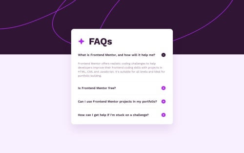
FAQ Accordion - Gulp, SASS/SCSS, Accessibility

Solution retrospective
Hello I'm Szeri 👋, This is my solution. What do you think about it?
Technology💻:
- HTML, SASS/SCSS, JavaScript
- Gulp
- NPM
Adventages🏅:
- minified CSS and JavaScript code
- optimalized images
Conclusion💡:
It was a very simple and at the same time very difficult project. I had to choose between writing entirely my own code or using <details> and <summary> tags and losing full control of the code. What I mean is that if you use ready-made code, you have to read a lot and know exactly what it does. During my first session, I chose the predefined tags and everything was fine. I styled them and started animating them. I used CSS animation and JavaScript eventListener. At first glance, everything was fine. On the first click, all sections were animated and accessibility worked fine, but... when I opened the same section a second time, the animation didn't work. In my readme file you will find a link to a very useful article that I received from Klrfl in the discord group. I knew this could be problematic and I was right, so I decided to write my own code that animates and triggers the animation when the button is clicked. I will give myself time and come back stronger to complete the task based on predefined elements, for now the job has been done and all assumptions have been met.
If you have any tips regarding my code or problem, please let me know.
Please log in to post a comment
Log in with GitHubCommunity feedback
No feedback yet. Be the first to give feedback on Szeri's solution.
Join our Discord community
Join thousands of Frontend Mentor community members taking the challenges, sharing resources, helping each other, and chatting about all things front-end!
Join our Discord