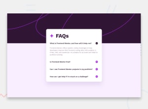
Design comparison
Solution retrospective
I need your feedback i tried to add a transition to the paragraphs while being shown but I couldn't, and for the background, I don't know how to achieve it like the challenge wanted it to be ...
Community feedback
- @Serdarq1Posted 10 months ago
For background you can add two different divs one for the top section and other for the rest of the page and organize their style backgorunds, colors etc. And I noticed that i have to click on plus icon for answer to be shown you can change it by creating a parent element that contains question, plus icon and the answer and add event listener to that parent element instead of the plus icon hope you find that helpful
Marked as helpful2 - @danielmrz-devPosted 10 months ago
Hello @badrEladraoui1!
Your project looks very good!
- Here's how I added the background pattern:
body {
    background-color: $Bg-pink;
    background-image: url('assets/images/background-pattern-mobile.svg');
    background-position: top center;
    background-repeat: no-repeat;
    background-size: contain;
    @media (min-width: 640px) {
        background-image: url('assets/images/background-pattern-desktop.svg');
        background-position: 0 -10vh;
    }
I used SASS, that's why part of the code is nested.
I hope it helps you!
Marked as helpful1
Please log in to post a comment
Log in with GitHubJoin our Discord community
Join thousands of Frontend Mentor community members taking the challenges, sharing resources, helping each other, and chatting about all things front-end!
Join our Discord
