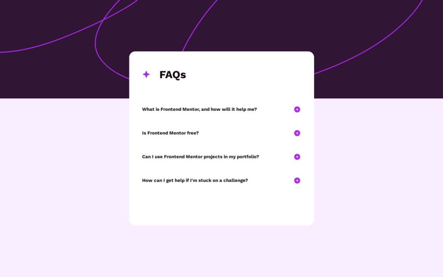
Design comparison
Solution retrospective
I am open for every comment.
Community feedback
- @tatasadiPosted 12 months ago
Hey there,
Excellent work on completing the Frontend Mentor FAQ challenge using React! Your implementation showcases a solid understanding of React concepts, Redux for state management, and CSS for styling. Here are a few suggestions to enhance your project further:
Border Separation for Questions: Adding a
border-bottomto each FAQ item will visually separate the questions, making the UI cleaner and more user-friendly. This small change can significantly improve readability.Cursor Pointer for Icons: For a better user experience, the plus and minus icons should change the cursor to a pointer on hover. This indicates that these elements are clickable and interactive, conforming to standard UI practices.
Responsive Design Adjustments: Avoiding fixed width and height for the card is a good practice for responsive design. Instead, consider using
max-widthto maintain the card's aspect ratio while allowing it to adjust to different screen sizes. This approach prevents content overflow in mobile view and enhances the responsiveness of your application.Box-Shadow for Card: Adding a
box-shadowto the card can provide depth and elevate the card from the background, enhancing the visual appeal. This subtle effect can make the interface more engaging and modern.Marked as helpful1
Please log in to post a comment
Log in with GitHubJoin our Discord community
Join thousands of Frontend Mentor community members taking the challenges, sharing resources, helping each other, and chatting about all things front-end!
Join our Discord
