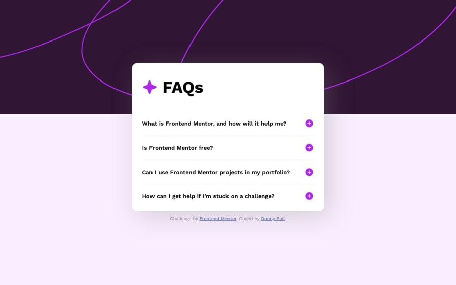
Design comparison
Solution retrospective
- How is my semantic HTML?
- How is my implementation of clicking on the question to expand the answer, including the expanding height and changing plus/minus icon?
- What improvements could be made to my CSS (
assets/css/main.css)? - What CSS animations could be added/improved to make a better user experience?
- How is my accessibility and what ways could it be improved?
- Of course, any other thoughts/suggestions are welcome! Thanks!
Community feedback
- P@danielmrz-devPosted about 1 year ago
Hey Danny!
Your solution looks awesome!
I just have one suggestion:
- You don't need to have separate containers to create that background pattern. You can use both
background-colorandbackground-imagetogether on the body. They will not cancel each other.
I hope it helps!
Other than that, great job!
Marked as helpful3@dannypoitPosted about 1 year ago@danielmrz-dev Thanks Daniel! I tried that just now, and it does work, so I will keep that in mind!
1 - You don't need to have separate containers to create that background pattern. You can use both
- @vanzasetiaPosted about 1 year ago
Hi, Danny! 👋
Congratulations on finishing this challenge! 👏
I recommend using the
<details>and<summary>tags to create the accordion panels. Those elements are already having the close-and-open functionality. This way, you do not need to add JavaScript—which is good to have less code.If you want to keep using the
<button>element, you need to addaria-expandedattribute to tell the state of the accordion—whether it is open or closed. Doing this allows users who use assistive technologies to know the state of the accordion.For progressive enhancement, you can try making sure that the buttons are removed when the JavaScript is blocked. You may not know that your JavaScript fails to arrive at the user's browser—Everyone has JavaScript, right?. If you want an example, you can visit inclusivedesignprinciples.org and try disable JavaScript.
I hope this helps. Happy coding! 👍
Marked as helpful1@dannypoitPosted about 1 year ago@vanzasetia I had no idea about
<details>and<summary>! That does make it very easy and is a very cool option, but how do I hide the triangle? I tried the CSS in this article, but it didn't work. In fact, I tried all kinds of CSS on the ::marker pseudo-element, but the only one that worked was changing its color to transparent and then setting a negative margin on the summary to position the text where the marker would be:summary { margin-left: -1.25rem; width: calc(100% + 1.25rem) !important; } summary::marker { color: transparent; }But that seems kinda hacky.
Thank you for all the info though. I definitely have some studying up to do on accessibility.
0@vanzasetiaPosted about 1 year ago@dannypoit
You can remove it by changing the
displayof the<summary>. By default, it hasdisplay: list-item.You are welcome! 👍
0 - @techyjcPosted about 1 year ago
Great work! From my general observation the semantic markup looks good.
Adding support for screen readers by adding role and aria-label would be the next logical step. See an example grabbed from the W3c I've included the link at the bottom.
<section **role="contentinfo"** **aria-label="What kind of Axeman are you?"**><h2>What kind of Axeman are you?</h2><p>Are you a Fender guy or a Gibson gal? Well if it’s good enough for Jimi, it’s good enough for me!</p><p>[…]</p><h3> The first Fender Guitars</h3><p>[…]</p></section>Marked as helpful1@dannypoitPosted about 1 year ago@techyjc Thank you! I admittedly don't know much about supporting screen readers, so that is an area I need to study up!
1@vanzasetiaPosted about 1 year ago@techyjc
Hi, John! First things first, what are you trying to suggest? Does the example that you give have anything to do with this project?
Then, why do you need to add
role="contentinfo"to the<section>? Why don't you just use<footer>? Also, why do you need to addaria-labelwhen there is already<h2>inside it?In the first place, why do you use
<section>element?1@techyjcPosted about 1 year agoHi @vanzasetia, Danny posted questions for the community with his completed challenge and my response was based on the question about accessibility. I was suggesting a possible next logical step might be to add support for screen readers.
While I understand your point regarding the heading tag contained within explaining the elements content. There is an exact example of this given by the W3c. I have included the code example from the W3c.
<section role='contentinfo' aria-label='Gibson Guitars'><h2>Gibson Guitars</h2><p>I want an SG but don’t want to take out a mortgage, Dear Abby.. got a problem</p><p> More about my feelings of deprivation due to lack of antique Gibson guitars</p></section>From the document it indicated if you use a section element that will contain information relevant to the user then you should add the role and aria attributes to highlight these to the reader as a (landing zone). Otherwise if it's just needed as styling element then use a div instead.
I wasn't trying to be critical.. Just offering some suggestions..🙂 I also included the link in my original response to demonstrate how and why for reference.
0@vanzasetiaPosted about 1 year ago@techyjc
I think your suggestions are not relevant to this.
Also, the link that you share is not reliable.
"It does not necessarily represent consensus and it may have incorrect information or information that is not supported by other Working Group participants, WAI, or W3C."
Another thing, the page is a very old document.
"This page was last modified on 24 July 2014, at 16:03."
For me, it is better not to use
<section>since it is not needed in this case. It is also not the next step to make the page easier for screen reader users.Also, highlighting a section without any good reasons is only going to add unnecessary noise for screen reader users.
Then, I recommend referring to a more updated resource: WebAIM: HTML Semantics and Accessibility Cheat Sheet.
About my questions, I want to make sure that I understand why you are suggesting that. That is why I was asking those questions to ensure that your suggestion is correct and relevant to this.
1@techyjcPosted about 1 year ago@vanzasetia Fair enough. Point taken. Didn't see the last modified on the page to be honest. Apologies.😬
1
Please log in to post a comment
Log in with GitHubJoin our Discord community
Join thousands of Frontend Mentor community members taking the challenges, sharing resources, helping each other, and chatting about all things front-end!
Join our Discord
