

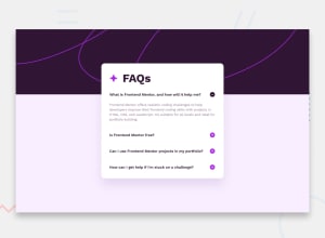
Design comparison
SolutionDesign

Solution retrospective
any helpful feedback my first js project 🙏.
Community feedback
- @kimodev1990Posted 11 months ago
Really nice work completing the challenge, Just s a simple feedback :-
- You could use clamp ( ) method in your coding for font-size, width, margins, padding, etc., So the designed sizes will change according to the viewport dimensions having a responsive design and will be suitable for any device layout .
- With font-size, Use rem or em units than px for better responsiveness .
Hope you find this Helpful.
Other than that, Really Nice work & keep Going on
Marked as helpful1

Please log in to post a comment
Log in with GitHub
Join our Discord community
Join thousands of Frontend Mentor community members taking the challenges, sharing resources, helping each other, and chatting about all things front-end!
Join our Discord