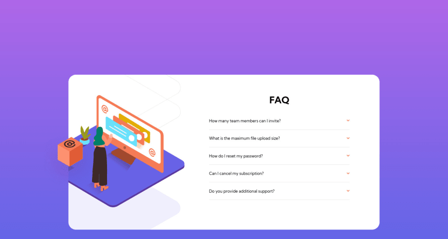
Design comparison
Community feedback
- @samuelpklmPosted over 2 years ago
Your solution is perfect according to the specifications of the exercise. But it looks bad that the height of the card grows a lot when activating all the questions. I suggest you see my solution: (https://www.frontendmentor.io/solutions/faq-accordion-with-htmlcssjs-HkNVRB5Eq) In which I control through events, the activation and hiding of all the cards, to keep the height of my card within a desired margin. This can be done with JQuery's slideDown and slideUp actions.
Marked as helpful0@RazielTXPosted over 2 years ago@samuelpklm Hi Samuel! Thanks a lot for the feedback man! Yeah, I had the same idea at some point, however I stopped and thought for one moment that I, as "potential client", always prefer a little bit more of control on what I have open using accordions. Therefore, I decided to "sacrifice" the fixed size of the main container.
Yeah, I will try now to do it with Bootstrap and jQuery. It was interesting to do it first CSS only, for example I discovered the details tag which forced me to improve and research a little bit more about CSS animations, etc.
I've checked your solution and it's great! I was imagine my JS code and definitely it would be too much longer than yours, haha! Thanks a lot! I will keep an eye on it.
0
Please log in to post a comment
Log in with GitHubJoin our Discord community
Join thousands of Frontend Mentor community members taking the challenges, sharing resources, helping each other, and chatting about all things front-end!
Join our Discord
