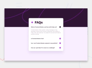
Design comparison
Solution retrospective
Had a blast working on this project and added a few enhancements! 🚀
Community feedback
- @danielmrz-devPosted 10 months ago
Hello @aykinsancakli!
Your solution looks great!
I have a suggestion for improvement:
- Use
<main>to wrap the main content instead of<div>.
Tags like
<div>and<span>are typical examples of non-semantic HTML elements. They serve only as content holders but give no indication as to what type of content they contain or what role that content plays on the page.📌 This tag change does not impact your project visually and makes your HTML code more semantic, improving SEO optimization as well as the accessibility of your project.
I hope it helps!
Other than that, great job!
Marked as helpful0@aykinsancakliPosted 10 months ago@danielmrz-dev Thank you, I'll definetely switch from div to main. I generally use article tag to wrap the card like things. But I'm not sure that's 100% correct.
1@danielmrz-devPosted 10 months ago@aykinsancakli
The tag
<article>would make more sense if the card was part of a bigger website (it certainly would in real world), but here it is all we have on the screen.1 - Use
Please log in to post a comment
Log in with GitHubJoin our Discord community
Join thousands of Frontend Mentor community members taking the challenges, sharing resources, helping each other, and chatting about all things front-end!
Join our Discord
