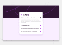
Design comparison
Community feedback
- Account deleted
Your design development was good but I think you need to add some tweaks to your [answer-toggle] class
.answer-toggle { display: flex; justify-content: space-between; align-items: center; cursor: pointer; gap:1rem; }
I just added a gap
0@mo-adel99Posted 11 months ago@IamUPO why add a gap there when justify-content is already space-between, i see it pointless as i want each of them to stick to the edge so gap doesn't add anything here
0Account deleted@mo-adel99 you realise on the small screen size the icon and text squash together that's why I insisted
0@mo-adel99Posted 11 months ago@IamUPO true but that was fixed using by setting fixed width for the icon so it doesn't get squished
adding a gap made it worse actually, as it pushed the icon by 1rem to the right
thanks for you time checking it 😀
1
Please log in to post a comment
Log in with GitHubJoin our Discord community
Join thousands of Frontend Mentor community members taking the challenges, sharing resources, helping each other, and chatting about all things front-end!
Join our Discord

