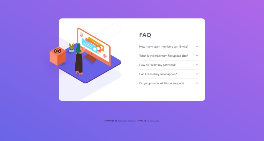
Design comparison
Solution retrospective
Creating the layout for the accordion with the arrows on the right hand side, I used flex and separated the question text and the arrow icon using space-between. This has meant that I have only got the dropdown part to work when click the text. Any advice on an improvement to this so that clicking the icon also activates the dropdown would be great.
Community feedback
- @nathanieladiahPosted over 2 years ago
Hey Good Job on the challenge!
In order to get the dropdown to work when clicking the arrow as well as the text, I'd suggest not using a separate
<img>
tag for the arrow. I'd suggest using something like the::after
pseudo-element to add the arrow.This works with your current code to get the arrow in the correct position:
.accordion-btn::after { content: ''; background-image: url(./images/icon-arrow-down.svg); background-repeat: no-repeat; position: absolute; top: 50%; right: 0; transform: translateY(-50%); width: 10px; aspect-ratio: 1; }
Then you can remove the
display: flex
in.accordion-question
so that the.accordion-btn
takes up the whole width:.accordion-question { padding-top: 1.5rem; cursor: pointer; }
This way clicking anywhere will trigger the
onclick
event.Marked as helpful0@cove86Posted over 2 years ago@nathanieladiah thank you very much for this. This will help me massively going forward.
0 - @SamadeenPosted over 2 years ago
Hey!! Cheers 🥂 on completing this challenge.. .
Here are my suggestions..
- You should nest your
divs
img
paragraphs
headings
in amain
tag to improve navigation. - Go down orderly when you are using the headings h1 down to h2 down to h3 and so on.
- You can wrap your attribution section in a footer tag to avoid accessibility issues.
- You should add a
alt
text to yourimg
tag to aid screen-readers
This should fix most of your accessibility issues and HTML issues
. Regardless you did amazing... hope you find this useful... Happy coding!!!
Marked as helpful0@cove86Posted over 2 years ago@Samadeen thank you, will make sure I implement all of that going forward.
0 - You should nest your
Please log in to post a comment
Log in with GitHubJoin our Discord community
Join thousands of Frontend Mentor community members taking the challenges, sharing resources, helping each other, and chatting about all things front-end!
Join our Discord