Design comparison
SolutionDesign
Solution retrospective
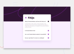
My responsive in this project is very bad, but I did correctly the viewscreen required for the challenge (which were desktop Desktop: 1440px, Mobile: 375px). Without this issue, I think it works pretty well.
Community feedback
- @victordlh29Posted 10 months ago
Hello, it's me here again, it's a pleasure to greet you, I saw your code again to continue helping you, I was surprised how good you already are with the class and the ID, you are evolving, keep it up, I liked the responsive, it needs to be polished more for other resolutions but it complies and is what is needed and expected for this challenge.
0
Please log in to post a comment
Log in with GitHubJoin our Discord community
Join thousands of Frontend Mentor community members taking the challenges, sharing resources, helping each other, and chatting about all things front-end!
Join our Discord
