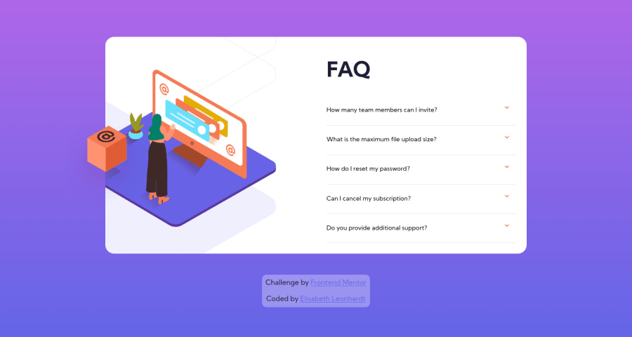
Design comparison
Solution retrospective
I would really appreciate feedback regarding 2 things:
- It took me forever to position the different images and I am curious to know whether I did a decent job or whether there is a better(?)/more responsive way to do it.
- I also used SASS and I am never sure when it's best to nest, to use variables and so on, so if you have a moment to give me some feedback on how I did there, that would be awesome!
Community feedback
- @grace-snowPosted about 4 years ago
Hi,
This looks and works great on mobile, well done!
The html isn't valid at the moment but could be remedied quite easily by doing something like
<h2 class="faq-button">
    <button class="question">
        How many team members can I invite? <img class="button-icon" src="./images/icon-arrow-down.svg" alt="">
    </button>
</h2>
<p class="answer hidden">
    You can invite up to 2 additional users on the Free plan. There is no limit on team members for the Premium plan.
</p>
That would maintain/improve accessibility and fix all those html errors in your report. Hope that's helpful ☺
In terms of your css, I wouldnt nest at all except when I have to. So I might look for the presence of an is-open class on the parent of an faq answer, or I might nest things like hover states and pseudo elements, but I wouldn't nest anything else. It increases specificity unnecessarily and can cause problems later on in bigger projects.
2@MiaSingerPosted about 4 years ago@grace-snow Hi Grace, thank you so much for your answer! I could correct the HTML errors so now my report is down to 0. :) Thank you also for your comment on nesting: I reviewed some past projects and I tend to nest quite deeply. With your answer, I also googled around a little and it seems to be a quite controversial topic: https://bradfrost.com/blog/post/sass-selectors-to-nest-or-not-to-nest/ https://medium.com/@lakesare/deeply-nested-scss-is-good-42fc7305f12b
since I tend to nest a lot, I will for now challenge myself to nest less ;) Thanks again for your great answer!
0 - @En-JenPosted about 4 years ago
Hey Elisabeth, nice job on this challenge!! It definitely took me forever to position the images too, so not sure if I'll be much help in that regard. Looks like your accordion is working well and it's responsive. I also like the animation you included for the box image.
I noticed that the text color isn't changing when the user hovers over the questions in the accordion. It looks like you just used the wrong CSS selector for that declaration. Instead of
button:hover {
    color: $hover-color;
  }
it should be
.faq-button:hover {
    color: $hover-color;
  }
It would also be nice to have the cursor set to pointer on the questions in the accordion. I'd also recommend changing your media query to a bit of a wider screen width because at 1000px width, the box image is getting cut off a little on the left side.
Happy new year and happy coding! -Jen
1
Please log in to post a comment
Log in with GitHubJoin our Discord community
Join thousands of Frontend Mentor community members taking the challenges, sharing resources, helping each other, and chatting about all things front-end!
Join our Discord
