Design comparison
SolutionDesign
Community feedback
- @JunasVeePosted over 2 years ago
Hi DawidMTX!
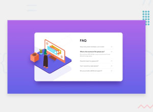
I saw that there's no orange box image file in your folder, so I assume that the problem is that the wanted file is missing.
Your solution works as it should, great. But it seems like it has some issues with the UI/UX or the styling. Here are the things that you might want to fix:
- If I'm not mistaken, the card's background should be white/#fff instead of grayish-blue as it shows in the design example. But it doesn't really matter since background can be changed easily anytime.
- The top, left, and right side of the
box-shadowis too big that it makes the violet background looks really dark near the card. - In large screen sizes the text is too tiny, I suggest you increase the
font-sizea bit for both headings and p tags. - In large screen sizes the FAQs go all the way up to the top of the container instead of standing still at the center just like the design example shows. Since you're using flexbox to position your elements, you can add
align-items: center;to the main tag in the CSS so that it'll vertically centers the components in any screen size.
You provide what the challenge wants you to provide regardless of how the output looks but improving it would be better, Great Job and keep going.
Marked as helpful0
Please log in to post a comment
Log in with GitHubJoin our Discord community
Join thousands of Frontend Mentor community members taking the challenges, sharing resources, helping each other, and chatting about all things front-end!
Join our Discord
