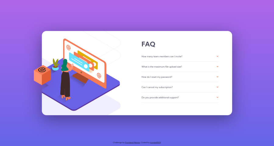
Design comparison
SolutionDesign
Solution retrospective
I am open to feedback as to how I can improve the responsiveness of the images, which was a great challenge for me. Thanks!
Community feedback
- @kens-visualsPosted about 3 years ago
Hey @jcombs0929 👋🏻
I have some quick tips to help fix the accessibility and HTML issues.
- First,
<div class="attribution">...</div>should be<footer class="attribution">...</footer>. - Next, in this case instead of
<section>, I suggest using regular<div>for a couple of reasons. First, when you use a<section>you have to have a heading, likeh1-h6. Next,<section>is for bigger parts of layout, such as, contact us about us, image gallery, etc. These will fix the accessibility issues. Don't forget to generate a new repot once you fix the issues. - Also, all the following images should have
aria-hidden="true", since they are for decoration only. You can read more aboutaria-hiddenhere.
<img src="./images/illustration-box-desktop.svg" aria-hidden="true" class="img__desktop--box">
<img src="./images/illustration-woman-online-desktop.svg" aria-hidden="true" class="img__desktop--inner-top">
<img src="./images/bg-pattern-desktop.svg" aria-hidden="true" class="img__desktop--inner-bottom">
I hope this was helpful 👨🏻💻 All in all, you did an excellent job, keep it going. Cheers 👾
Marked as helpful0@jcombs0929Posted about 3 years ago@kens-visuals Thank you very much for the helpful feedback! I will work on implementing those.
1 - First,
Please log in to post a comment
Log in with GitHubJoin our Discord community
Join thousands of Frontend Mentor community members taking the challenges, sharing resources, helping each other, and chatting about all things front-end!
Join our Discord
