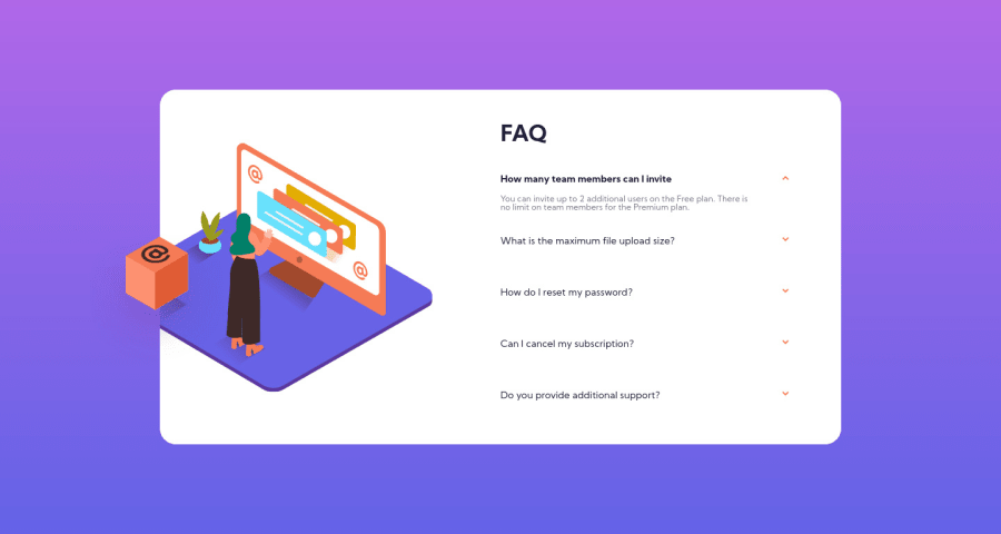
Design comparison
Solution retrospective
Any feedback would be great! Sometimes I feel that I'm not sure the best way to go about positioning elements with padding and margins or with absolute and relative positioning, etc.
Community feedback
- @codeswithrohPosted over 3 years ago
First of all appearance-wise, bigger fonts and line-height would be a little better. Next about the coding part, I think that instead of setting a width in % for every component just write the html and give some padding and margin to it and instead of writing media query for each element separately try to write it in one place but its just my opinion, there's no harm in your style. For positioning I would tell you to follow the process I mentioned above because I personally don't like absolute or relative positioning because that makes the responsiveness a bit hard. But at the end you did a great work
1@wisniewskizPosted over 3 years ago@codeswithroh Thank you so much for the feedback! Yeah, I really need to learn how to use all different types of responsive sizing and positioning in their best use cases. I'll definitely do some reading and some more practicing and refactor this code to work a bit better.
I'm also noticing now that I'm missing some design elements that I didn't see in my figma files, so it's another good chance to make the design better. And finally not forget my alt attributes that I'm almost always missing.
Once again, thank you!
0
Please log in to post a comment
Log in with GitHubJoin our Discord community
Join thousands of Frontend Mentor community members taking the challenges, sharing resources, helping each other, and chatting about all things front-end!
Join our Discord