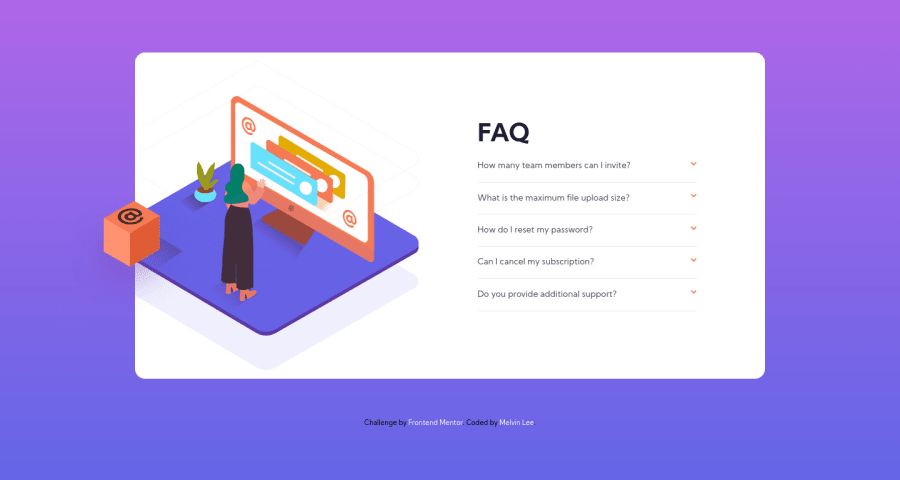
Design comparison
Solution retrospective
Hi there! Thanks for viewing my solution. I have a few questions.
1 - When do I use background image instead of a HTML img tag, (or even a pseudo element) to render an image? I tried experimenting the woman image and settled with a background image in desktop view and img tag for mobile.
2 - How do I prevent absolute position elements from moving when the accordion opens and closes?
3 - How do I centralise my entire layout with absolute positioned elements?
4 - How may I improve on my code?
Thanks!
Community feedback
- @RaelianPosted over 3 years ago
Heya, nice design! Regarding your img vs background-image, I'm gonna post below one of the best answers I could find after a google search. Hope it helps!
"Use the HTML IMG tag when you want the image to be a part of the content in the regular page flow. Use the IMG tag if you want the image to be included when users print the page. Use the HTML IMG tag when you want the image to be indexed by google (with alt text inclusion).
Use the CSS background-image property when the image is not part of the regular page flow, and in instances where only a portion of the image shows up on the page and is used for more decorative purposes. Use the CSS background-image property when you don't want images on your page to print. Use the CSS background-image property if you need to improve image download times (as with CSS sprites). Use the CSS background-image property if you are using the image for animations or rollover states." ~ Edward M.
2@MelvinMelonGitPosted over 3 years agoHi @Raelian,
Thanks for your reply! I will try applying this for my next challenge :)
0 - @AgataLiberskaPosted over 3 years ago
Hi Melvin!
-
It depends but a good rule of thumb is that if an image adds to the content of the page (or helps to understand the content better), use
<img>
tag so that it's accessible to screen reader users (and of course a good alt text is a must then). If it's only decorative, either img with empty alt text or background-image (personally I find the latter easier to work with, but it might just be me!) -
I think you're talking about the box? It moves because it's positioned 45% from the top, and when the accordions expand, the top of your card moves up, so the box moves with it. Hope this helps you find a solution :)
-
I'm not sure I understand what you mean, can you explain?
I wouldn't set max-width on the body (my screen is wider than 1440px and the whole layout is off-center). And setting height: 100vh makes the background repeat on smaller mobile sizes when the accordions are open - changing it to min-height would be an easy fix :)
On mobile, the image gets cut off at the top, it would be a good idea to add more space for it - make sure you view your solution using device toolbar in your browser :)
Most importantly though, you need to make sure that your solution is accessible - in this case it means allowing the user to toggle the accordions using keyboard. This is my favourite article talking about how to achieve this
1@MelvinMelonGitPosted over 3 years agoHi @AgataLiberska,
Thanks for your reply!
-
I will take this into consideration in my future challenges.
-
Thanks for pointing that out. I guess instead of positioning the card in the centre using flexbox, I may try doing so via flex-start or using "top".
-
In the mobile view, the entire layout seems to be more top-heavy because of the woman image. I'm wondering what can be done to centre the layout so that the entire card (with the woman) looks centre.
-
Ah I see, ok will keep that in mind. And thanks for the article as well! :)
0@AgataLiberskaPosted over 3 years ago@MelvinMelonGit Ohh I see... I'm not sure to be honest, but as
position: absolute
takes the element out of the normal flow of the document (so other elements behave like it's not there at all), I think the only option may be to account for it with extra margin or something like that.0 -
Please log in to post a comment
Log in with GitHubJoin our Discord community
Join thousands of Frontend Mentor community members taking the challenges, sharing resources, helping each other, and chatting about all things front-end!
Join our Discord