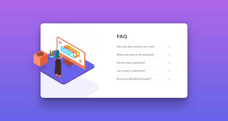
Design comparison
Solution retrospective
This took me three days... Javascript took the longest but i definitely learned a lot more from this project compared to the others.
Community feedback
- P@kens-visualsPosted over 3 years ago
Hey @lmaoken 👋🏻 it's Ken 😅
I've got some suggestions to help you fix the accessibility and HTML issues.
- In your markup,
<section class="card">...</section>should be<main class="card">...</main>. This will fix the accessibility issues. Don't forget to generate a new repot once you fix the issues. - Instead of
<section>, I suggest using regular<div>for a couple of reasons. First, when you use a<section>you have to have a heading, likeh1-h6. Next,<section>is for bigger parts of layout, such as, contact us about us, image gallery, etc. - Also, the following to images should have
aria-hidden="true"like so:
<img src="images/illustration-woman-online-desktop.svg" aria-hidden="true">
<img src="images/illustration-box-desktop.svg" aria-hidden="true">
because they are for decorative purposes only. You can read more about
aria-hiddenhere.I hope this was helpful 👨🏻💻 you did a superb job, especially with responsiveness. Well done, keep it up. Cheers 👾
Marked as helpful2@kenreibmanPosted over 3 years ago@kens-visuals Hi ken!! Thank you for this detailed feedback. I really appreciate these tips that help me improve for the future.
Even if it was a few minutes out of your day it means a lot to me when someone leaves a comment like this. It was definitely very helpful. Thank you again!
0P@kens-visualsPosted over 3 years ago@lmaoken you're welcome Ken 😇 I'll keep an eye for your future projects and try to give as much feedback as possible ✌🏻
1@kenreibmanPosted over 3 years ago@kens-visuals Quick question, how do you get your projects so near-perfectly sized to the original size? I seem to always get it too small.
0P@kens-visualsPosted over 3 years agoOCD, perfectionism, you name it 😂 now, seriously @lmaoken, I open the picture full size and constantly go back and forth until I get it sometimes it works, and sometimes it doesn't. Certainly, practice makes it perfect
1@kenreibmanPosted over 3 years ago@kens-visuals Absolutely, I'll definitely try matching it more with the picture next time. I just have it on a little side window on vscode so it's all about guessing for me. Thanks for the replies, I gave you a follow as well, can't wait to see what other great challenges you complete!
0P@kens-visualsPosted over 3 years ago@lmaoken yeah, I used to do that too. It's convenient, but really effective. Thanks, oh yeah I have something interesting coming, stay tuned ✌🏻
1 - In your markup,
- @kenreibmanPosted over 3 years ago
LIVE VERSION IS UPDATED TO HAVE BETTER VISUALS AND IMPROVED SIZING. -- If I ever get PRO I'll update the screenshot.
0
Please log in to post a comment
Log in with GitHubJoin our Discord community
Join thousands of Frontend Mentor community members taking the challenges, sharing resources, helping each other, and chatting about all things front-end!
Join our Discord
