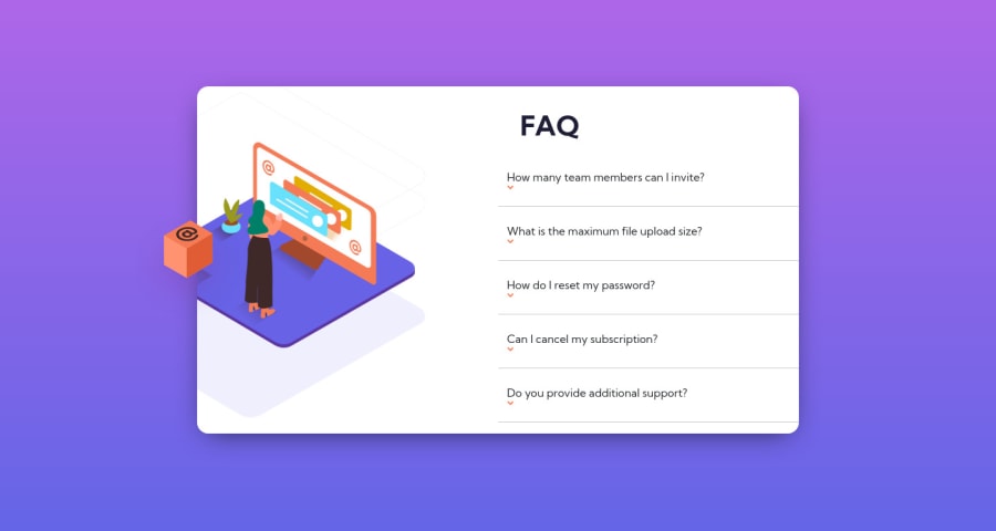
Design comparison
Solution retrospective
So this challenge was the most stressful and complicated i just gonna do this
What did you find difficult while building the project? the cuttng of the image
Which areas of your code are you unsure of? the <picture> cuz i found someone who did i they disappear and in the end i couldn't understand how they made the cut
Do you have any questions about best practices? i dont hhhhmmm maybe how to make the icons to be on the right
Community feedback
- @BilalSalmiPosted about 2 years ago
Hi Ash, good job, your design is good.
I notice that your icons are below.
your can aligned with text using the follwing code:
display: inline-block; margin-left: 5px;that happed because you set display property to "block", that's why your icons are right below the text.
you can read more about css display here.
Keep it up!
Marked as helpful1
Please log in to post a comment
Log in with GitHubJoin our Discord community
Join thousands of Frontend Mentor community members taking the challenges, sharing resources, helping each other, and chatting about all things front-end!
Join our Discord
