

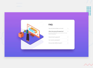
Design comparison

Solution retrospective
The challenge I had in coding this project was probably trying to make it responsive due to the background and the images being in peculiar places for both the desktop and mobile. I used a few resources to get the JavaScript to work and try to fully understand the logic in making the accordion, which made me more confident in using DOM. Overall, it took a while but it was a very enjoyable project to code!
Community feedback
- @kowsirahmedPosted almost 2 years ago
@jCasia Very good job. Absolutely responsive. Love It.
One thing I noticed is that, the box gets very big at 800px.
- width property should be in % or vw unit which makes the element change its size with the container or viewport.
width: 80% - max-width should be set in px or rem or em units which makes the element maxed at a certain limit.
max-width: 600px - The above 2 can be combined in one line:
width: min(80%, 600px).
Marked as helpful0@jCasiaPosted almost 2 years ago@kowsirahmed Thank you for the tips!😊 the images were a real problem for me!
0 - width property should be in % or vw unit which makes the element change its size with the container or viewport.

Please log in to post a comment
Log in with GitHub
Join our Discord community
Join thousands of Frontend Mentor community members taking the challenges, sharing resources, helping each other, and chatting about all things front-end!
Join our Discord