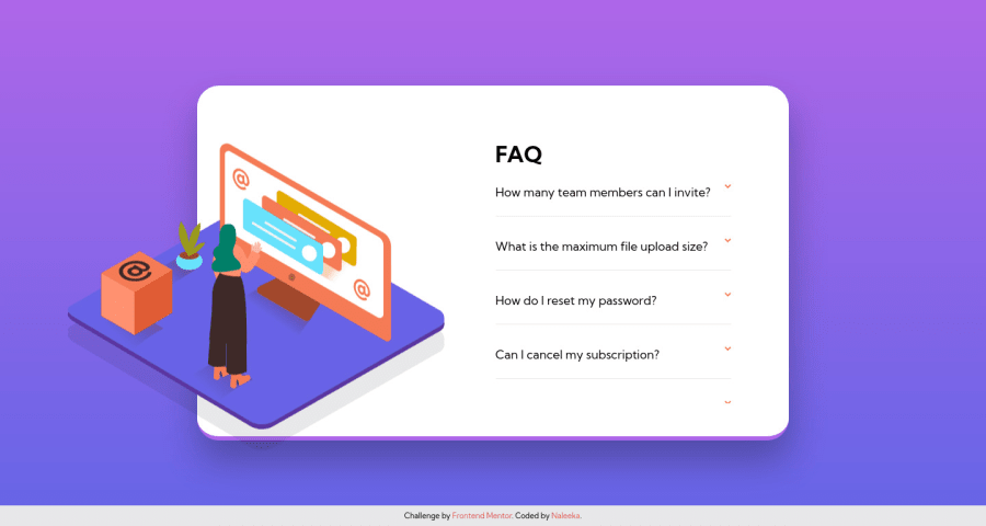
Faq Accordion Card (Using pure HTML & CSS)
Design comparison
Solution retrospective
👨🚀 This is my solution for Faq accoridon card challenge
The challenge was to complete this without using JavaScript
Break points
- 1440px -Desktop Devices
- 768px -Tablet Devices
- 375px -Mobile Devices
Feel free to leave your thoughts
Community feedback
- @vanzasetiaPosted over 2 years ago
Hi, Naleeka! 👋
Congratulations on finishing this challenge! 🎉
For accordions, I would recommend using the native HTML elements,
summaryanddetailselements. It's much easier to style and by default, it is accessible by screenreaders since it tells the screenreader whether the accordion panel is expanded or collapsed.Regarding the breakpoints for the media queries, you should add media queries whenever it is needed. Those breakpoints should not be based on specific screen sizes. You want to add media queries whenever it is needed like when the layout is broken. Currently,
1440pxwidth for the desktop layout is too late. I would recommend adjusting the media queries breakpoint.That's it! I hope this helps! 🙂
Marked as helpful1
Please log in to post a comment
Log in with GitHubJoin our Discord community
Join thousands of Frontend Mentor community members taking the challenges, sharing resources, helping each other, and chatting about all things front-end!
Join our Discord
