
FAQ Accordion Card using plain HTML, CSS, and JS

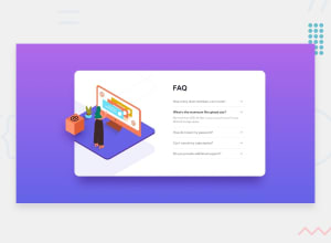
Design comparison

Solution retrospective
Any feedback is greatly appreciated.
I feel like I spent a lot of time using absolute positioning on this one. Is there a better solution to this?
Community feedback
- @agusc01Posted over 2 years ago
Hi Kenny, nice work ! . Try to use more relative units than absolute units (try to remove "px")
Anyway it's a wonderful challenge. Keep coding
1 - @vanzasetiaPosted over 2 years ago
Hello, Kenny! 👋
Good job on this challenge! Your solution looks pretty good! It's good to know that you are leaving all the
altempty for all decorative images. By doing that, you make the users of the screen reader focus on listening to the content.About the absolute positioning, I also did position the illustrations using that method. It took some guessing to position the images. Anyway, you have done a great job on this one! It looks similar compared to the design, so don't worry about it. 😉
There are two things that I would highly recommend doing.
- I would recommend using the native HTML elements for the accordion elements,
summaryanddetailselements (they are accessible by default). Currently, by usingdiv, I can't control the accordion panel using the keyboard and the screen reader can't tell that it is an interactive element. - I would suggest using the
remor sometimesemunits instead ofpx. Usingpxwould not allow the user to control the size of the elements based on their needs.
Overall, you have done great work. It's great that you already know that not all images need alternative text, in this case, all images are decorative and if you are using the native HTML elements to create the accordion, that would make your site more accessible than how it is.
That's it! Hope this helps. 😊
0 - I would recommend using the native HTML elements for the accordion elements,


Please log in to post a comment
Log in with GitHubJoin our Discord community
Join thousands of Frontend Mentor community members taking the challenges, sharing resources, helping each other, and chatting about all things front-end!
Join our Discord