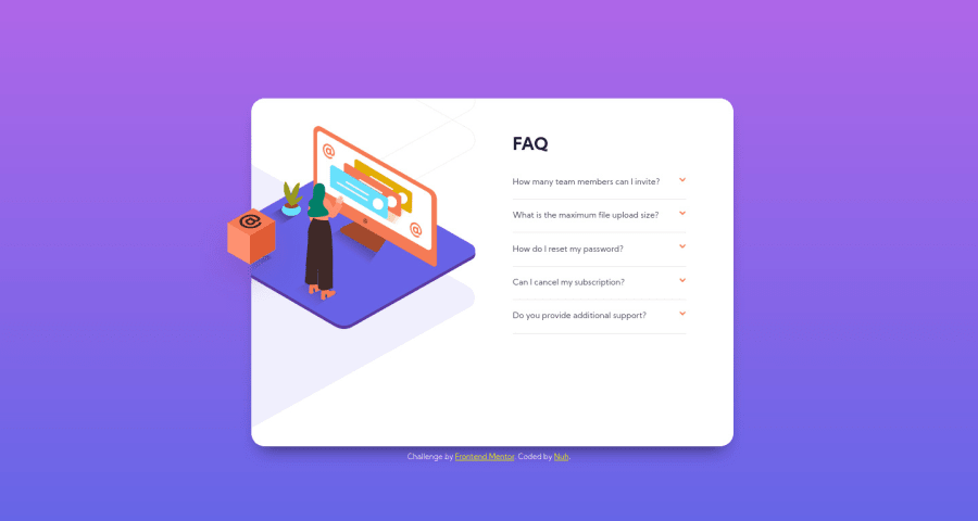
Design comparison
SolutionDesign
Solution retrospective
Any feedback appreciated. Thanks
Community feedback
- @martam90Posted almost 4 years ago
Hi, your solution looks nice. I would suggest two things:
- Add line-height to .answer, so the text will looks a little bit nicer,
- You can try to hide the content of .answer by clicking on arrow up again. If you know JavaScript a bit, that might helps a lot but I think it is possible to make it in HTML/CSS as well.
0@Nuh-hPosted almost 4 years ago@martam90 I appreciate the feedback, thank you very much. I do know JS but trying to avoid it was also part of the challenge. I can't claim to know how it is done with pure CSS, but maybe there's trick with HTML to do it. I will try it sometime.
0
Please log in to post a comment
Log in with GitHubJoin our Discord community
Join thousands of Frontend Mentor community members taking the challenges, sharing resources, helping each other, and chatting about all things front-end!
Join our Discord
