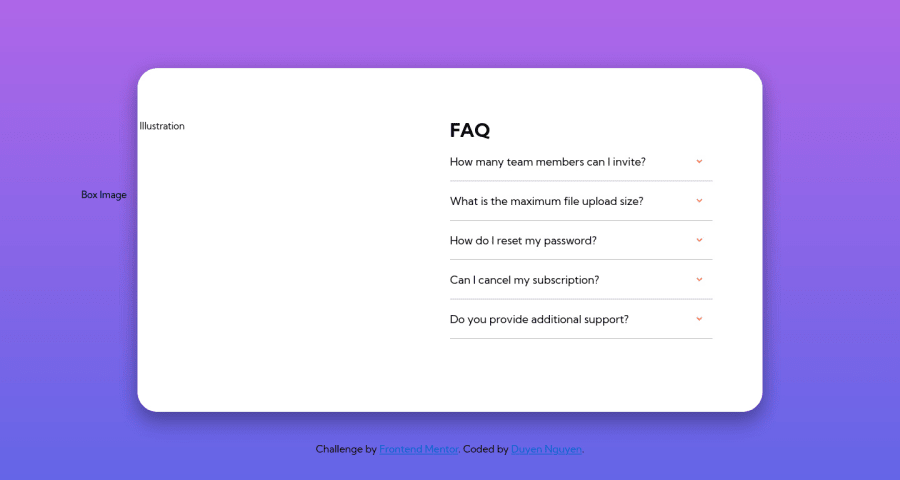
Design comparison
Solution retrospective
I spent 2 days for completing this challenge. One thing remained unsolved is on mobile version, the background pattern does not look exactly same as the original design. I am self teaching web development so I would be really grateful for any code reviews and feedback from you all! Any help greatly appreciated!
Community feedback
- Account deleted
I had the same issue with the background, the way I found to fix it was to set min-height to 100vh on the general styles for the body (before any media query). Don't know if it's the ideal solution but it worked for me.
Marked as helpful0@Duyen-codesPosted about 3 years ago@RyukioMiyamoto I see! Thanks for sharing! I really appreciate it. I'll definitely keep that in mind.
0 - @eleswastakenPosted about 3 years ago
There are two types of paths relative and absolute. In your solution you can't see images, try adding a dot in front of every path to files.
Don't set fixed heights to containers. When you open several answers, it overflows. So instead just use paddings and margins. For example, you could set
max-widthto your container andmargin: 50px auto 0to "center" it.For question-answers you should use
<details>and<summary>, Link.Marked as helpful0@Duyen-codesPosted about 3 years ago@eleswastaken Thanks very much for your feedback! I'll work on this again later applying your suggestions!
0
Please log in to post a comment
Log in with GitHubJoin our Discord community
Join thousands of Frontend Mentor community members taking the challenges, sharing resources, helping each other, and chatting about all things front-end!
Join our Discord
