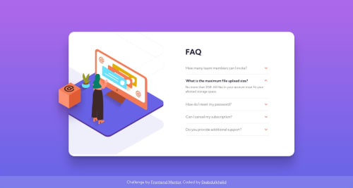
Submitted over 2 years agoA solution to the FAQ accordion card challenge
FAQ Accordion Card 🎯 [ USING DETAIL SUMMARY - VANILLA CSS3 - BEM ]
accessibility, bem, lighthouse
@0xabdulkhaliq

Solution retrospective
👾 Hello, Frontend Mentor Community,
This is my solution for the FAQ Accordion Card Challenge .
- I learned how to use and style the
<details>and<summary>HTML elements. - Eventhough the
<details>doesn't need JavaScript i used it to ensure that only one summary want to show up during others are closed. - If all summary are opened it's not looking nice, so only i provided that logic using js
- Scored 100% on Google Pagespeed Insights! 🤩
- Layout was built responsive via mobile first workflow approach
- Had a lots of fun building this challenge !
Now for the questions :
- I have no idea about heading structures, if you have any idea regarding to improve my heading structure then please leave a feedback
- And the
<details>element has support fortabfocus, so when the user hits thetabthenoutlinewill arise if user hit enter then summary is opened. But how a visibility disabled person can use this ? i used screen readers but i'm not satisfied with that - Finally, Feel free to leave any feedback and help me to improve my solution (or) make the code clean!
.
👨🔬 Follow me in my journey to finish all newbie challenges to explore solutions with custom features and tweaks
Ill be happy to hear any feedback and advice !
Code
Loading...
Please log in to post a comment
Log in with GitHubCommunity feedback
No feedback yet. Be the first to give feedback on Abdul Khaliq 🚀's solution.
Join our Discord community
Join thousands of Frontend Mentor community members taking the challenges, sharing resources, helping each other, and chatting about all things front-end!
Join our Discord