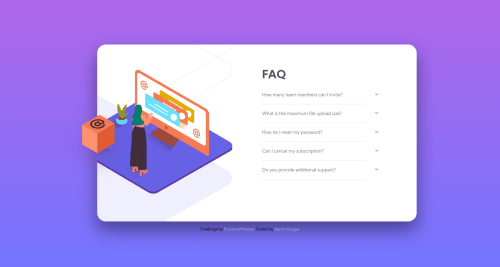
FAQ accordion card solution using semantic HTML and CSS(no JavaScript)
Design comparison
Solution retrospective
Just coded this project without JavaScript as the bonus said, need any comment to help in any way to improve in accessibility, semantic HTML and in general to a better code? Thanks
Community feedback
- @skyv26Posted almost 3 years ago
Please follow report to improve semantics and and accessability issues. In desktop response your orange box move towards left side when first time click over any question.
Overall 8/10 because you did all with just html and css only.
Marked as helpful0@adrianburgoscolasPosted almost 3 years ago@skyv26 thank you for your comment. I have some question:
- I completed the challenge without JavaScript because it said "Bonus: Complete the challenge without using JavaScript". Is it wrong?
- In the image showing the active states of the project the "orange box" is moved to the left when a question is clicked(it was what I see). Am I wrong? Please I'm just trying to give the best interpretation of the project. Could you give me your thoughts. Thank you
1@skyv26Posted almost 3 years ago@adrianburgoscolas
-
My friend it is absolutely a good practice and it is really appreciated, you have done marvellous job, that's why I liked your challenge by clicking on
heart. -
Orange box is going outside it can be fixed with css. It should be always at that place where initial it is, so from user experience point of view. It is something which is not good. I believe you also preferred satisfied work over complete task in hurry to get rid of difficulty.
I hope for best and share what i have, so it is my opnion that what I have wrote and I am happy that I am helping.
Marked as helpful0
Please log in to post a comment
Log in with GitHubJoin our Discord community
Join thousands of Frontend Mentor community members taking the challenges, sharing resources, helping each other, and chatting about all things front-end!
Join our Discord