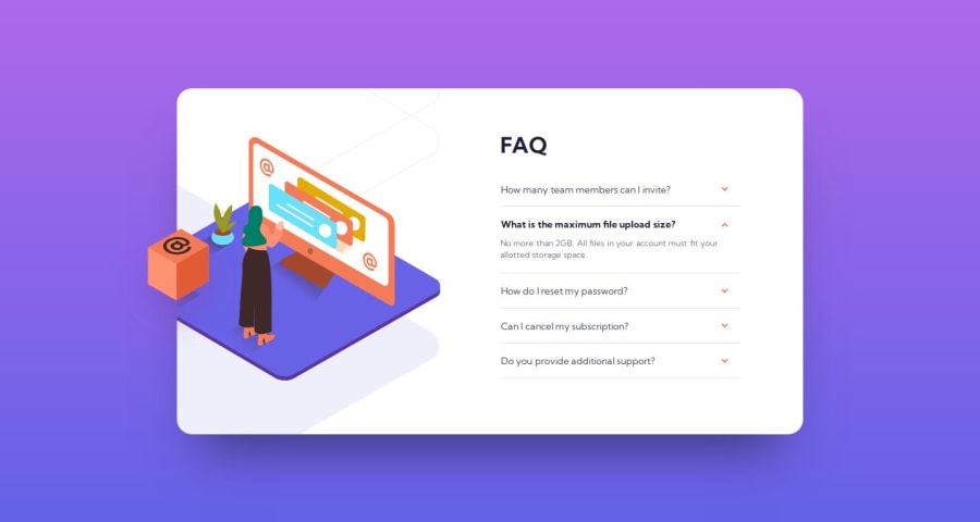
FAQ Accordion Card Solution [HTML + CSS, without any JS]
Design comparison
Solution retrospective
This solution doesn't use any JavaScript Code. Any suggestions and feedback are welcome. 😃
Community feedback
- @petritnurediniPosted 9 months ago
Congratulations on completing your FAQ Accordion Card project, Faruq Abdul Hakim! 🎉 Your effort in creating a responsive and interactive UI is commendable. Here are some best practices and tips to further refine your work:
-
HTML Semantics and Accessibility:
- Great job using semantic HTML elements! Consider adding
role="presentation"
to images that are purely decorative, like the.img-box
, to indicate they should be ignored by screen readers. - For accessibility, ensure that interactive elements like the FAQ toggles are usable with keyboard navigation. You might consider using
<button>
elements for the FAQ questions for better accessibility.
- Great job using semantic HTML elements! Consider adding
-
CSS Styling:
- Your CSS is well-structured and readable. To enhance maintainability, consider organizing your CSS properties consistently (e.g., positioning, box-model, typography).
- Use more descriptive class names for better readability. For example, instead of
.img-container
,.faq-container
, use.image-container
,.accordion-container
. - Avoid overqualifying selectors (e.g., use
.faq
instead ofdiv.faq
). This makes your CSS less specific and easier to override if needed.
-
Responsive Design:
- Your use of media queries for responsiveness is on point. Consider testing on various devices to ensure a consistent experience.
- For background images, use
background-size: cover
to ensure they cover the entire container without being distorted.
-
Performance and Optimization:
- Optimize your images for web use to improve page load times. Tools like TinyPNG can be helpful.
- Minimize the use of large background images, especially for mobile devices, to improve performance.
-
Code Organization:
- Externalize your CSS into a separate stylesheet to keep your HTML file clean and focused solely on structure.
- Comment your CSS to describe sections or complex parts for future reference.
References for Further Learning:
- Accessibility: Web Accessibility Initiative (WAI)
- CSS Best Practices: CSS Guidelines
- Responsive Web Design: Responsive Design Patterns
Keep up the great work! Each project you complete builds your skills and portfolio. Looking forward to seeing more of your projects in the future. Happy coding! 💻✨
Marked as helpful1 -
Please log in to post a comment
Log in with GitHubJoin our Discord community
Join thousands of Frontend Mentor community members taking the challenges, sharing resources, helping each other, and chatting about all things front-end!
Join our Discord