

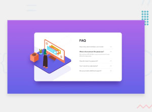
Design comparison
SolutionDesign

Solution retrospective
Somehow when I click on question, previous item doesn't hide properly, I don't know how to fix it.
Please log in to post a comment
Log in with GitHubCommunity feedback
- @semperprimum
Heya there 🙌
Some of the issues i noticed:
JS:
- Your JS code is too lengthy, it doesn't need to be 53 lines long :) In my opinion, a simple loop over all of the questions with a click listener is enough. You can check out my code to see what i mean. If you want to achieve the same behavior where it automatically closes all of the other questions, again, a second loop that just closes all of them is enough
- I see the problem you described, some of the sections don't collapse when you click on them too fast. My guess is that the issue is in
setTimeout()functions. Why have you added them in first place? Also, if you open and then close one section, you won't be able to open the same section again without toggling one of the other sections.
CSS:
body's min-height is already at 100vh, so why don't we use 2 lines of grid to center the.container, instead of positioning it absolutely and usingtranslateproperties?
body { display: grid; place-items: center; }- You use pixels for everything in your CSS. Using relative units like
remin CSS is recommended over absolute units likepixelsbecauseremallows for scalability and responsiveness, ensuring consistent and accessible designs across different devices and font size preferences. There are lots of articles and videos on the web that explain it in depth. Check them out :) - Your design switches to mobile at 1000px. Consider adding more breakpoints for a more fluid design. And use a
max-widthproperty so the card shrinks before going into a mobile version. For the mobile design, just set a margin for the component so it doesn't touch the borders of the screen and let it stretch. You can manage to get it done without using width properties. - Placing all media queries at the end of the document can make your code more organized and easier to read ;)
HTML:
- Questions and answers make more sense as a list (
<ul>,<ol>), instead of multiple sections. You may also wrap answers with a<p>tag, instead of using a<div>. - All of the images in this challenge are decorative, they don't need an
alttext. You should leave it empty. Go from this:<img src="..." alt="women and phone" class="desktop__image">to this:<img src="..." alt="" class="desktop__image">
Hope that you find this helpful! Happy coding!
Marked as helpful

Join our Discord community
Join thousands of Frontend Mentor community members taking the challenges, sharing resources, helping each other, and chatting about all things front-end!
Join our Discord