Design comparison
SolutionDesign
Solution retrospective
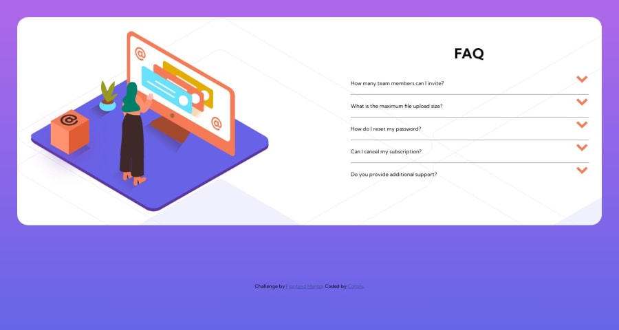
Fixed the positioning of a container and added a background image on desktop layout. Looking for general feedback and also help having my images spill outside of the container as the design is asking.
Thanks!
Community feedback
- @0xabdulkhaliqPosted almost 2 years ago
Hello there 👋. Congratulations on successfully completing the challenge! 🎉
- I have other recommendations regarding your code that I believe will be of great interest to you.
ACCORDION 🔴 :
- The best way to go with creating the accordion elements in this challenge would be with the
detailsandsummaryelements (or perhaps a combination of buttons and other elements).
- They are already fairly accessible and provided a clean, semantic way to create accordion elements. I see you have used the
div&h2elements for the accordions, but those are not interactive or accessible by keyboard, so not all users will be able to open the accordions to see the content inside.
- MDN's reference is a great place to start learning about the
detailsandsummaryelements if you are interested.
- If you have any questions or need further clarification, you can always check out
my submissionfor this challenge and/or feel free to reach out to me.
.
I hope you find this helpful 😄 Above all, the solution you submitted is great !
Happy coding!
Marked as helpful1
Please log in to post a comment
Log in with GitHubJoin our Discord community
Join thousands of Frontend Mentor community members taking the challenges, sharing resources, helping each other, and chatting about all things front-end!
Join our Discord
