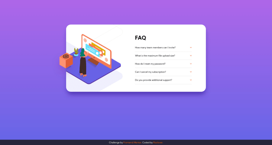
FAQ Accordion Card - Responsive using HTML, CSS, and JS
Design comparison
Solution retrospective
As always, feedback is much appreciated!
This took a little longer for everything to come together, but near the end, I got on a roll where I was able to figure out nearly all of the more difficult aspects pretty quickly (the images in desktop mode, the arrows turning upside down when you click on a question, etc). I'm glad I got to practice some JavaScript!
As a side note, I'm using a TV as an external monitor because my laptop screen is broken. Unfortunately, that means that sometimes my projects can look smaller to you guys than it does to me. My proportions are correct on my end, but I'm afraid that everything translates to be a bit small for everyone else. I have to figure that out. -_-
Community feedback
- @bague-rodnelPosted almost 3 years ago
Sometimes what I estimate by eye is way off compared to what I measure with tools. When I want a pixel perfect replica I load the design images in Figma. Constrain proportions and set width to 375px / 1440px and measure margin/heights/paddings with boxes. Trust those measures instead of your eye estimates regardless of how they present in your monitor.
I wish you get your screen fixed or better yet get a new laptop. Merry Christmas!
1 - @grace-snowPosted almost 3 years ago
Hello
There is one glaring issue that needs fixing on this I'm afraid. Whenever you have interactive behaviour it's essential to use interactive elements. In this case, I should be able to click on a button containing the question and icon. As there are no buttons at the moment, I cannot click them 😔
The buttons will also need
- aria-expanded attribute that toggles from false to true on click
- hover styles
- very obvious focus-visible styles
0 - @grizhlieCodesPosted almost 3 years ago
Overall a great solution, well done on everything! I agree with Rod on all points - hope you get yourself a new tool/fix your screen too :)
I think it would be more optimal to centre the images (Desktop view) in the vertical centre. If you open up all of the suggestions it leaves this odd white-space on the bottom of the images that I have to throw evil-eyes at 🤩.
If you want to practice even more javascript here, animate the anwsers to the questions when you click on a question. It's a fun exercise and I learned a ton from it that I honestly thought I already knew hehe.
To me transitions/animations are pretty important, almost as a part of accessibility now so I usually pay special attention to them. I also just find it 'nice'. If you need any advice/help with that just let me know. Or look at my solution for this to get a better idea. I was very.. let's call it specific with naming my JS variables just so I could later understand my code. It felt basically written in English by the end of it lol.
0
Please log in to post a comment
Log in with GitHubJoin our Discord community
Join thousands of Frontend Mentor community members taking the challenges, sharing resources, helping each other, and chatting about all things front-end!
Join our Discord