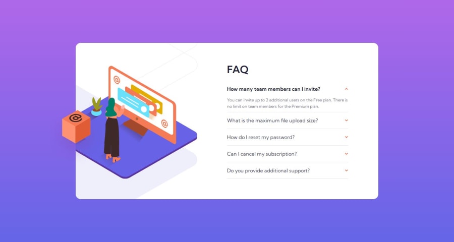
Design comparison
SolutionDesign
Solution retrospective
What are you most proud of, and what would you do differently next time?
I didn’t have any major problems when completing this challenge, but any suggestions for improvement would be appreciated, Jack
Community feedback
- P@huyphan2210Posted 7 months ago
Hi, @Jack-OC,
I reviewed your solution and have one suggestion:
- Your
.accordion-cardhas a width of60rem(960px) for viewports600pxor wider, which causes it to overflow on viewports between600pxand960px. I recommend adding another media query to handle this range.
Hope this helps! Good job!
0 - Your
Please log in to post a comment
Log in with GitHubJoin our Discord community
Join thousands of Frontend Mentor community members taking the challenges, sharing resources, helping each other, and chatting about all things front-end!
Join our Discord
