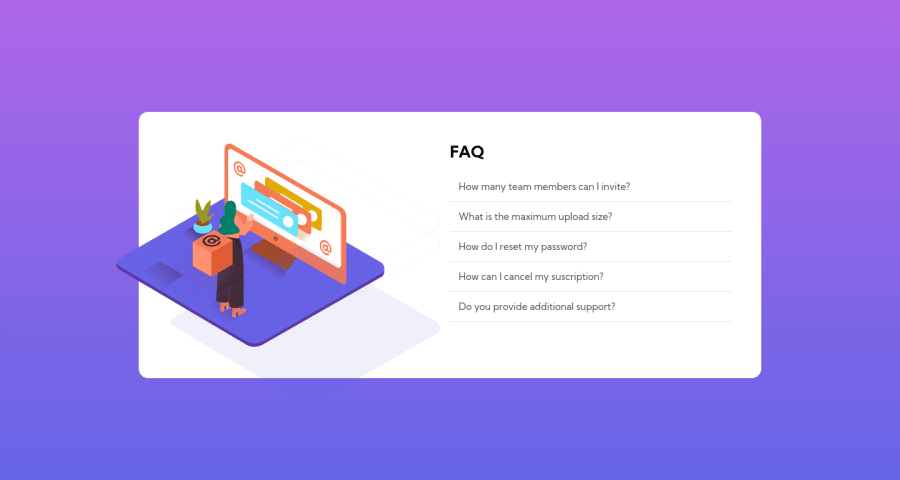
Design comparison
Solution retrospective
Another exercise completed!
The accordion was a big challenge but it came out fine, quite happy with the results. there is an accent next to the input arrow, don't know where that comes from.
my real struggle has come with the images. I can't place that floating box horizontally, the same goes for that shadow below the graphic. I also struggle to crop that icon outside of the card.
As for the mobile version, I haven't tried very hard, got really tired after working the accordion but I will look it. I have put everything in one single column, the accordion content is protruding from the card. I also need to place those images right on top of the card.
Any suggestion will be appreciated.
Best
Community feedback
- @AuddityPosted almost 3 years ago
Sorry for taking so long to respond, I just saw this.
I used a pseudo element and positioned it using absolute. However if I was doing it again I'd use the background property on the element itself (such as you have done) and use shorthand in the background property. If you're unfamiliar with the shorthand you can use properties such as background-orgin, background-position, background-size, etc. instead. You'll write less css with shorthand, but using the specific properties are easier to recognize what's happening right away.
Here's a link I like to reference when I need to remind myself of the shorthand for the background property: https://www.webfx.com/blog/web-design/background-css-shorthand/
Marked as helpful0@outerpreneurPosted almost 3 years ago@Auddity Thank you so much for the tip. I'll look into it!!
1 - @AuddityPosted almost 3 years ago
Good start!
I found this challenge easier to solve by designing mobile first. There's a specific illustration used just for mobile.
First suggestion I have is switch the classes .container and .card. The 'container' will hold your 'card', and the 'card' holds the rest of the content. Also, make the first element inside the body tag a main tag instead of a div (this main tag can be your .container). This will solve one of your HTML issues in the report as well.
In managing the illustrations, try putting them in their own 'container'. I'd suggest a <figure> tag to work as a 'container' element. Put the illustration that's just a box in it's own figure element, and both of the other illustrations (mobile & desktop) in a single figure element. With the box being in it's own container it can be hidden when in mobile view and when in desktop it can be positioned aboslute within your 'card' div.
Also, that will allow you to hide the overflow of the figure element that the desktop illustration is in. Giving you the ability to crop it.
As for the shadow image, I found it easier to place that in the css as a background to the card.
Hope this helps with some of the things you want to fix! Cheers.
Marked as helpful0 - @outerpreneurPosted almost 3 years ago
Thank you! Those were great tips. I have been able to do a few improvements, I have added the tags as mentioned above. I have also applied an overflow: hidden and put the shadow pattern as a background image in CSS. What would you use to position the background image right behind the graphic? Thanks again
1
Please log in to post a comment
Log in with GitHubJoin our Discord community
Join thousands of Frontend Mentor community members taking the challenges, sharing resources, helping each other, and chatting about all things front-end!
Join our Discord