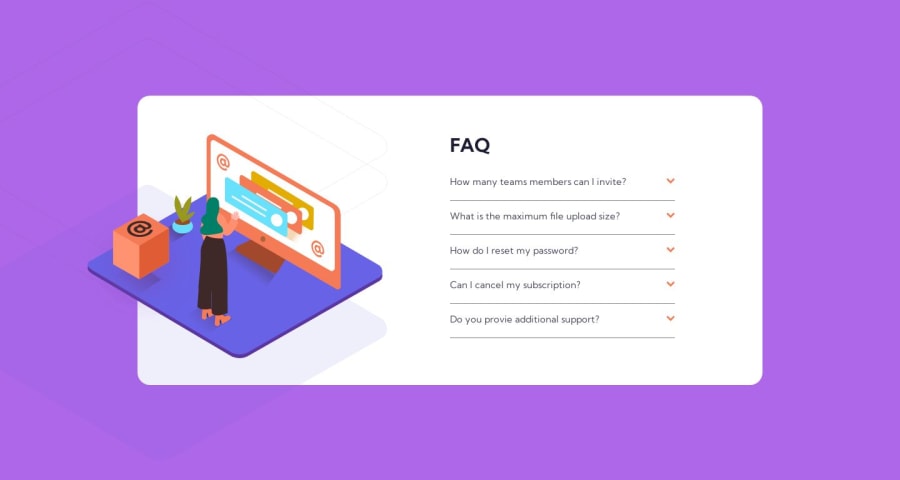
Design comparison
Solution retrospective
I haven't posted a solution in a while, so here is another one. I think i finally understood how to build faqs, but i believe the a other solutions to this problem. I will be very happy to to receive recommendations and feedbacks as to this solution. Thanks in advance four your help.
Community feedback
- @javascriptor1Posted over 1 year ago
Hi Brandon Alobwede ,
Nice work. I have just completed the challenge a few minutes ago. For desktop design, The corner of the image from the left side should not appear (the blue part). You may set the parent container overflow:hidden property .
Keep coding!.
0@BrandaoAPosted over 1 year ago@javascriptor1 Thanks alot i tried doing this for a long while and i wasn't successful.
0@javascriptor1Posted over 1 year agoHi @BrandaoA ,
I had a look at your code. overflow:hidden property is applied to parent container, not to the element itself as you did.
For this challenge, we can't apply overflow property to the main container - This will cause even the orange box to be cut for the overflow part. We don't want that.
Instead, apply the overflow property on the parent div for the image after you fix the layout and display.
This way, any part of the image outside the parent div will be cut and disappear.
I hope this help.
Good luck!.
0
Please log in to post a comment
Log in with GitHubJoin our Discord community
Join thousands of Frontend Mentor community members taking the challenges, sharing resources, helping each other, and chatting about all things front-end!
Join our Discord
