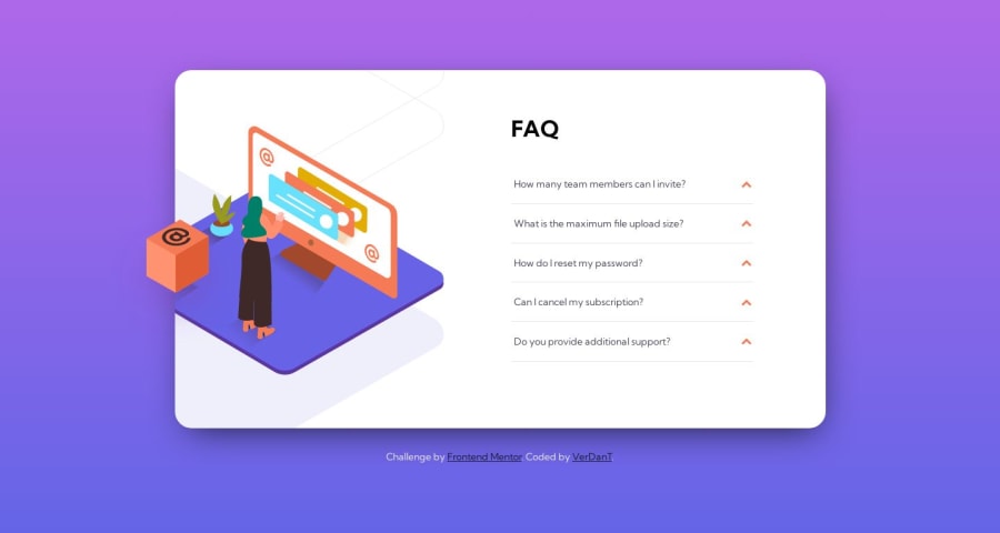
Design comparison
SolutionDesign
Solution retrospective
🖥 I built this component with only HTML and CSS 🤓
Honestly, the most tedious part of this project were the svg's, I had not used before the position absolute and relative properties and the most difficult part was to figure out how to apply the object-fit: cover to the svg, in this case only with the overflow: hidden I could do it, anyway, I liked the design, I'm sure it can be improved, but so far this is my result.
Any feedback will be welcome 🤓
Community feedback
Please log in to post a comment
Log in with GitHubJoin our Discord community
Join thousands of Frontend Mentor community members taking the challenges, sharing resources, helping each other, and chatting about all things front-end!
Join our Discord
