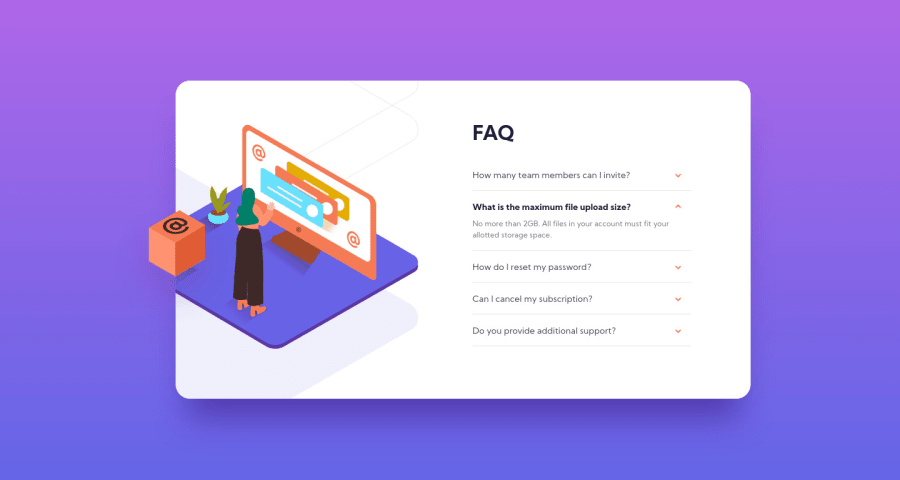
Design comparison
Solution retrospective
I know most of you have heard of vanilla.js, but have you ever heard malina.js 🤣? It just came out few months ago and I just saw it tonight and here is the result 🤪.
Feedbacks are welcome!
Community feedback
- @brasspetalsPosted about 4 years ago
It is possible! You can use radio buttons - tutorial here.
2@mattstuddertPosted about 4 years agoNice! I like that approach. Another pure HTML and CSS solution would be to use the
details
element. It's perfect for accordions! Here's some more info on MDN.1@brasspetalsPosted about 4 years ago@mattstuddert I had no idea this was a thing that existed. 🤯 Thank you!
0@mattstuddertPosted about 4 years ago@brasspetals no problem! For browsers that don't support it the accordions all just default to open as well. So it's a nice pattern to use that still "works" on older browsers 🙂
1 - @mattstuddertPosted about 4 years ago
Nice work, Connor! Never heard of Malina.js. Another tool to add to the ever-growing list of things to look into! 😅
Your solution looks great and is basically pixel-perfect, like usual which is awesome. My only suggestion for improvement would be to not put click listeners on non-interactive elements, like
div
elements. If someone was trying/needing to navigate the questions using anything other than a mouse/cursor, they wouldn't be able to. So as it is, this FAQ accordion is inaccessible to those people.As @brasspetals mentioned, you could use radio inputs. Or you could use the
details
element, which is designed for this kind of pattern.Keep up the great work!
1@zuolizhuPosted about 4 years ago@mattstuddert Hey Matt, thanks for the suggestion! I actually made one with
details
element, check out this link and I was asking if it is possible to close other accordions without js, and @brasspetals answered my question at the top 😆.I just realized the accessibility of frontendmentor.io is pretty good 🤪(using keyboard to navigate is super easy to recognize)! That's my improvement for the next project!
1@mattstuddertPosted about 4 years ago@zuolizhu haha, oops I assumed you had asked how the whole thing could be done without JS 😅 Improved accessibility is definitely a good aim for your next project!
0 - @ApplePieGiraffePosted about 4 years ago
Hey, Connor Z!
Sweet job! 👏
It's like pixel-perfect again!
Just one tiny thing—on my 13" screen, the last FAQ in the component slightly overflows its container if another FAQ with a lot of text content (meaning it takes up more height) is opened. Perhaps you could use
min-height
on the component or something to prevent it from becoming too short on smaller screens.Happy coding! 😁
1@zuolizhuPosted about 4 years ago@ApplePieGiraffe Thanks for the debugging😆! I want to maintain the background pattern of the card, that's why I set a max-height of it and didn't realize it won't fit on smaller screen. I will change it latter on.
Happy coding😁!
0
Please log in to post a comment
Log in with GitHubJoin our Discord community
Join thousands of Frontend Mentor community members taking the challenges, sharing resources, helping each other, and chatting about all things front-end!
Join our Discord